Backgrounds
In CSS, you can change what shows behind an element using background properties. You can set colors, images, or even gradients.
background-color
Use this to add a solid background color.
div {
background-color: blue;
}Example:
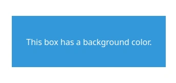
<div class="box">
This box has a background color.
</div>CSS:
.box {
width: 300px;
height: 100px;
margin-bottom: 1rem;
padding: 1rem;
color: white;
display: flex;
align-items: center;
justify-content: center;
background-color: #3498db;
}Output:
You can use:
- Named colors (blue, red, green)
- Hex codes (#3498db)
- RGB / RGBA
- HSL / HSLA
For transparency, use rgba() or transparent.
background-image
This adds a background image or gradient.
div {
background-image: url('/bg.png');
}Example:
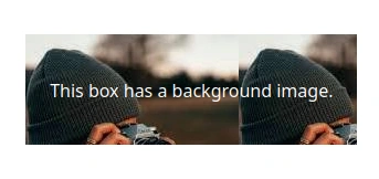
<div class="box">
This box has a background image.
</div>CSS:
.box {
width: 300px;
height: 100px;
margin-bottom: 1rem;
padding: 1rem;
color: white;
display: flex;
align-items: center;
justify-content: center;
background-image: url('/image.png');
}Output:
You can also use gradients:
div {
background-image: linear-gradient(to right, #4f46e5, #9333ea);
}Example:
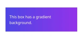
<div class="box">
This box has a gradient background.
</div>CSS:
.box {
width: 300px;
height: 100px;
margin-bottom: 1rem;
padding: 1rem;
color: white;
display: flex;
align-items: center;
justify-content: center;
background-image: linear-gradient(to right, #4f46e5, #9333ea);
}Output:
You can even mix an image and a gradient together.
background-image: url('/pattern.png'), linear-gradient(to right, #4f46e5, #9333ea);background-repeat
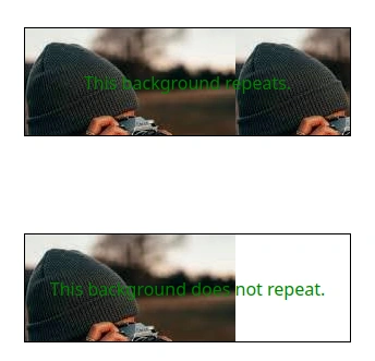
By default, background images repeat. You can control that:
div {
background-repeat: no-repeat; /* don’t repeat */
}Other values:
- repeat (default)
- repeat-x (horizontal only)
- repeat-y (vertical only)
Example:
<div class="box box1">This background repeats.</div>
<div class="box box2">This background does not repeat.</div>CSS:
.box {
width: 300px;
height: 100px;
margin-bottom: 1rem;
padding: 1rem;
color: green;
border: 1px solid black;
display: flex;
align-items: center;
justify-content: center;
background-image: url('/image.png');
}
.box1 {
background-repeat: repeat;
}
.box2 {
background-repeat: no-repeat;
}Output:
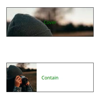
background-size
This controls how big your background image is.
div {
background-size: cover; /* fills the box, may crop */
}
div {
background-size: contain; /* fits image inside box */
}Example:
<div class="box box1">Cover</div>
<div class="box box2">Contain</div>CSS:
.box {
width: 300px;
height: 100px;
margin-bottom: 1rem;
padding: 1rem;
color: green;
border: 1px solid black;
display: flex;
align-items: center;
justify-content: center;
background-image: url('/image.png');
background-repeat: no-repeat;
}
.box1 {
background-size: cover;
}
.box2 {
background-size: contain;
}Output:
You can also use exact sizes:
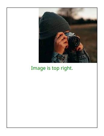
background-size: 200px 100px;background-position
Sets where the background image appears inside the box.
div {
background-position: center; /* center of box */
background-position: top right; /* top right corner */
}Example:
<div class="box">Image is top right.</div>CSS:
.box {
width: 300px;
height: 400px;
margin-bottom: 1rem;
padding: 1rem;
color: green;
border: 1px solid black;
display: flex;
align-items: center;
justify-content: center;
background-image: url('/image.png');
background-repeat: no-repeat;
background-position: top right;
}Output:
background-attachment
Controls the scroll behavior of background images.
background-attachment: fixed | scroll | local;Note: fixed may not work well on mobile browsers.
background-blend-mode
Lets you mix an image and a gradient together.
background-blend-mode: multiply | screen | overlay;Example:
div {
background-image:
linear-gradient(rgba(0, 0, 0, 0.4), rgba(0, 0, 0, 0.4)),
url('/photo.jpg');
background-blend-mode: overlay;
}Shorthand: background
You can write multiple background values in one line:
background: background-image background-repeat background-position;
background: url('/img.jpg') no-repeat center/cover;Borders & Border Radius
border
The border property adds a line around an element like a box.
div {
border: 2px solid #000;
}
This example creates:
- A 2px thick
- solid line
- black color (#000)
Parts of a border:
border-width: How thickborder-style: The type of line (solid, dashed, dotted, double, none)border-color: The color
You can also add borders to specific sides:
For example:
div {
border-top: 1px dashed #e11d48;
border-left: 5px solid #1d4ed8;
}
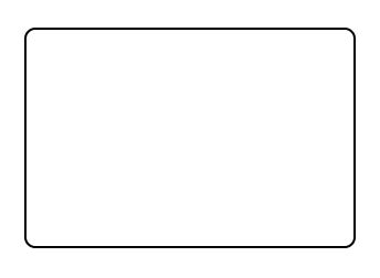
border-radius
This makes the corners of a box rounded.
div {
border-radius: 10px;
}
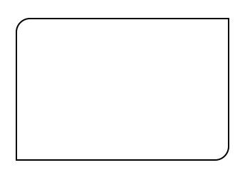
You can control each corner:
div {
border-radius: 20px 0 20px 0;
/*border-radius: top-left, top-right, bottom-right, bottom-left; */
}
To make a circle or oval:
div {
border-radius: 50%;
}This works best when the element has equal width and height.
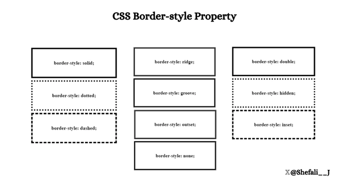
Border Style
You can use the border-style property in CSS to define the style of an element’s border.
Syntax:
element {
border-style: value;
}Common Border Styles
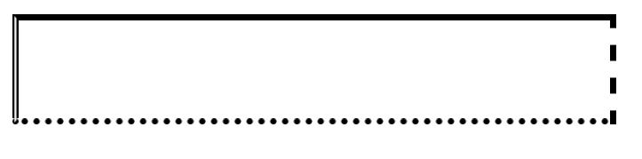
Applying Different Styles to Each Side
You can specify different border styles for each side of an element.
Example:
<!DOCTYPE html>
<html lang="en">
<head>
<meta charset="UTF-8" />
<meta name="viewport" content="width=device-width, initial-scale=1.0" />
<title>Border Style</title>
<style>
div {
width: 300px;
height: 50px;
border-style: solid dashed dotted double; /* Top, right, bottom, left */
}
</style>
</head>
<body>
<div></div>
</body>
</html>
Combination with Other Properties
You can use border-width, border-color, and border-radius alongside border-style for more customization.
Example:
<!DOCTYPE html>
<html lang="en">
<head>
<meta charset="UTF-8" />
<meta name="viewport" content="width=device-width, initial-scale=1.0" />
<title>Border Style</title>
<style>
div {
width: 300px;
height: 50px;
border-radius: 5px;
border: 3px solid blueviolet;
}
</style>
</head>
<body>
<div></div>
</body>
</html>
If border-style is not specified, the border will not be shown, even if border-width or border-color is defined.
Box Shadow and Drop Shadow
Both box-shadow and drop-shadow create shadow effects, but they work differently and have distinct use cases.
box-shadow
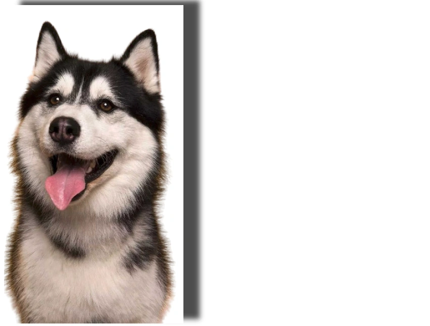
The box-shadow property is used to add a shadow effect to the box of an element, which includes the content, padding, and borders. This means it applies a shadow around the rectangular box that wraps the element.
Syntax:
box-shadow: h-shadow v-shadow blur-radius spread-radius color inset;- h-shadow: Horizontal shadow offset (positive value moves the shadow to the right, negative to the left).
- v-shadow: Vertical shadow offset (positive value moves the shadow down, negative up).
- blur-radius: The blur effect of the shadow. The higher the value, the more blurred the shadow.
- spread-radius: (Optional) Expands or contracts the shadow.
- color: The color of the shadow.
- inset: (Optional) Creates an inner shadow instead of an outer shadow.
Example of box-shadow:
<!DOCTYPE html>
<html lang="en">
<head>
<meta charset="UTF-8" />
<meta http-equiv="X-UA-Compatible" content="IE=edge" />
<meta name="viewport" content="width=device-width, initial-scale=1.0" />
<title>Box Shadow</title>
<style>
img {
height: 400px;
box-shadow: 20px -6px 6px rgba(0, 0, 0, 0.7);
}
</style>
</head>
<body>
<div>
<img src="dog.png" alt="Dog picture" />
</div>
</body>
</html>
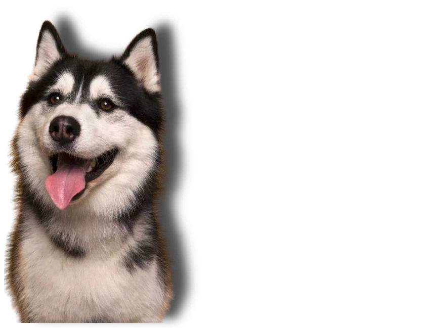
drop-shadow
The drop-shadow() is a CSS filter function that is applied to images, videos, and other elements. Unlike box-shadow, which creates shadows around the box of an element, drop-shadow applies a shadow that follows the shape of the element itself, making it useful for non-rectangular objects (such as images with transparency).
Syntax:
filter: drop-shadow(h-shadow v-shadow blur-radius color);- h-shadow: Horizontal shadow offset (positive value moves the shadow to the right, negative to the left).
- v-shadow: Vertical shadow offset (positive value moves the shadow down, negative up).
- blur-radius: The blur effect of the shadow. The higher the value, the more blurred the shadow.
- color: The color of the shadow.
Example of drop-shadow():
<!DOCTYPE html>
<html lang="en">
<head>
<meta charset="UTF-8" />
<meta http-equiv="X-UA-Compatible" content="IE=edge" />
<meta name="viewport" content="width=device-width, initial-scale=1.0" />
<title>Drop Shadow</title>
<style>
img {
height: 400px;
filter: drop-shadow(20px -6px 6px rgba(0, 0, 0, 0.7));
}
</style>
</head>
<body>
<div>
<img src="dog.png" alt="Dog picture" />
</div>
</body>
</html>
Key Differences
| Feature | box-shadow | drop-shadow |
|---|---|---|
| Target | Shadows are applied to the box of an element (including padding, borders). | Shadows are applied to the shape of the element, following its contours. |
| Shape | Always applies to a rectangular box. | Follows the element's actual shape (including transparent areas). |
| Use Cases | Used for creating shadow effects around elements like buttons, cards, and boxes. | Used for applying shadows to images, graphics, and other shapes. |
| Performance | Works well with all elements, especially rectangular ones. | Best for elements with transparent or non-rectangular shapes. |
| Appearance | The shadow is always rectangular or square around the element. | The shadow conforms to the element's outline, especially useful for images with transparent backgrounds. |
Opacity, RGBA, HSLA
These handle transparency and color control, crucial for layering effects and visual clarity.
Opacity
Controls the entire element’s transparency, including content and children.
div {
opacity: 0.5;
}Values:
- 1 = fully opaque (default)
- 0 = fully transparent
- Any value between (e.g., 0.75)
Important: This affects all children — not ideal if you want only the background to be semi-transparent.
rgba()
RGBA = Red, Green, Blue, Alpha (opacity)
background-color: rgba(0, 0, 0, 0.6); /* 60% opaque black */- Alpha = 0 (transparent) → 1 (opaque)
- Perfect for transparent backgrounds without affecting child elements.
- Used commonly in overlays, modals, and semi-transparent backgrounds.
hsla()
HSLA = Hue, Saturation, Lightness, Alpha
background-color: hsla(270, 60%, 60%, 0.7);- Hue: 0–360° on the color wheel
- Saturation: 0–100% (0 = grayscale)
- Lightness: 0–100% (0 = black, 100 = white)
- Alpha: 0–1 (transparency)
Benefits of hsla():
- Easier to tweak shades of the same color (just adjust lightness)
- Useful for theming with consistent saturation and varying hues.
Filters (backdrop filter)
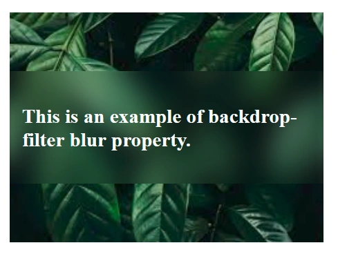
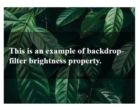
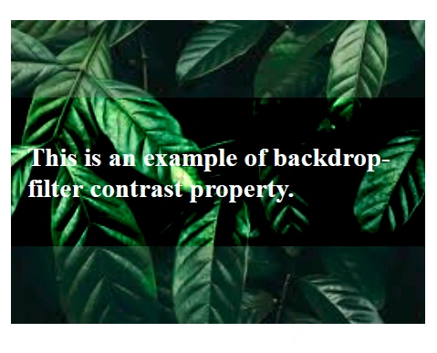
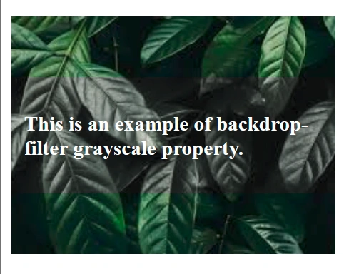
The backdrop-filter property allows you to apply visual effects (such as blur, brightness, contrast, etc.) to the area behind an element.
This is especially useful for creating frosted glass or blurred background effects on elements like modals, navigation bars, or overlays.
The filter is applied to the content behind the element, not the element itself. It works best on elements with transparency, like semi-transparent backgrounds or overlays.
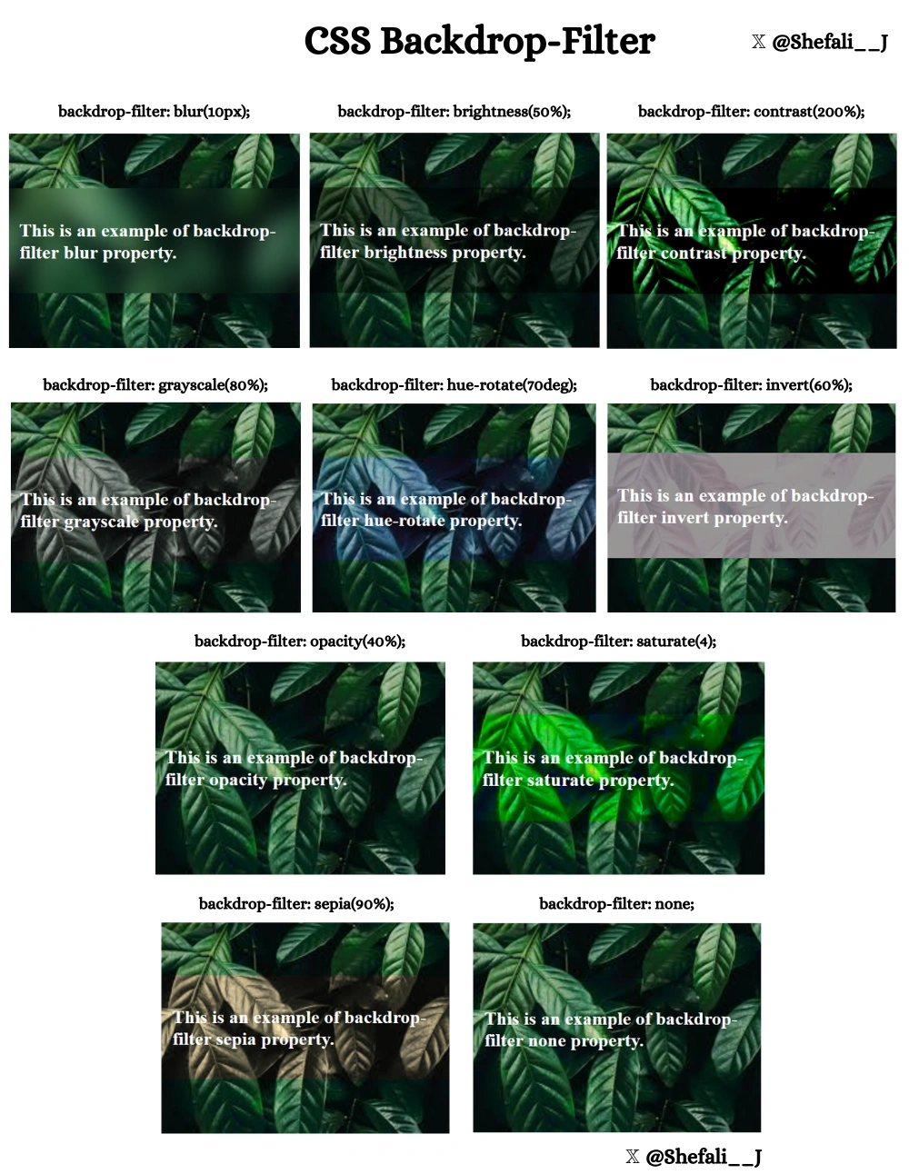
Examples with common values for backdrop-filter
Example 1: backdrop-filter: blur(10px);
<!DOCTYPE html>
<html lang="en">
<head>
<meta charset="UTF-8" />
<meta name="viewport" content="width=device-width, initial-scale=1.0" />
<title>Backdrop-Filter</title>
<style>
.container {
display: flex;
align-items: center;
justify-content: center;
height: 350px;
width: 250px;
background: url(img.jpg) no-repeat center;
}
.box {
padding: 10px;
font-weight: bold;
color: white;
background-color: transparent;
backdrop-filter: blur(10px);
}
</style>
</head>
<body>
<div class="container">
<div class="box">
<p>This is an example of backdrop-filter blur property.</p>
</div>
</div>
</body>
</html>
Example 2: backdrop-filter: brightness(50%);
<!DOCTYPE html>
<html lang="en">
<head>
<meta charset="UTF-8" />
<meta name="viewport" content="width=device-width, initial-scale=1.0" />
<title>Backdrop-Filter</title>
<style>
.container {
display: flex;
align-items: center;
justify-content: center;
height: 350px;
width: 250px;
background: url(img.jpg) no-repeat center;
}
.box {
padding: 10px;
font-weight: bold;
color: white;
background-color: transparent;
backdrop-filter: brightness(50%);
}
</style>
</head>
<body>
<div class="container">
<div class="box">
<p>This is an example of backdrop-filter brightness property.</p>
</div>
</div>
</body>
</html>
Example 3: backdrop-filter: contrast(200%);
<!DOCTYPE html>
<html lang="en">
<head>
<meta charset="UTF-8" />
<meta name="viewport" content="width=device-width, initial-scale=1.0" />
<title>Backdrop-Filter</title>
<style>
.container {
display: flex;
align-items: center;
justify-content: center;
height: 350px;
width: 250px;
background: url(img.jpg) no-repeat center;
}
.box {
padding: 10px;
font-weight: bold;
color: white;
background-color: transparent;
backdrop-filter: contrast(200%);
}
</style>
</head>
<body>
<div class="container">
<div class="box">
<p>This is an example of backdrop-filter contrast property.</p>
</div>
</div>
</body>
</html>
Example 4: backdrop-filter: grayscale(80%);
<!DOCTYPE html>
<html lang="en">
<head>
<meta charset="UTF-8" />
<meta name="viewport" content="width=device-width, initial-scale=1.0" />
<title>Backdrop-Filter</title>
<style>
.container {
display: flex;
align-items: center;
justify-content: center;
height: 350px;
width: 250px;
background: url(img.jpg) no-repeat center;
}
.box {
padding: 10px;
font-weight: bold;
color: white;
background-color: transparent;
backdrop-filter: grayscale(80%);
}
</style>
</head>
<body>
<div class="container">
<div class="box">
<p>This is an example of backdrop-filter grayscale property.</p>
</div>
</div>
</body>
</html>
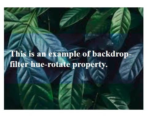
Example 5: backdrop-filter: hue-rotate(70deg);
<!DOCTYPE html>
<html lang="en">
<head>
<meta charset="UTF-8" />
<meta name="viewport" content="width=device-width, initial-scale=1.0" />
<title>Backdrop-Filter</title>
<style>
.container {
display: flex;
align-items: center;
justify-content: center;
height: 350px;
width: 250px;
background: url(img.jpg) no-repeat center;
}
.box {
padding: 10px;
font-weight: bold;
color: white;
background-color: transparent;
backdrop-filter: hue-rotate(70deg);
}
</style>
</head>
<body>
<div class="container">
<div class="box">
<p>This is an example of backdrop-filter hue-rotate property.</p>
</div>
</div>
</body>
</html>
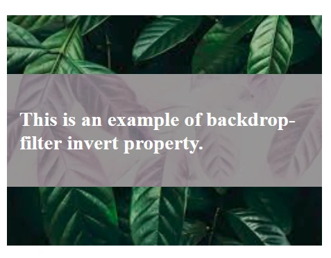
Example 6: backdrop-filter: invert(60%);
<!DOCTYPE html>
<html lang="en">
<head>
<meta charset="UTF-8" />
<meta name="viewport" content="width=device-width, initial-scale=1.0" />
<title>Backdrop-Filter</title>
<style>
.container {
display: flex;
align-items: center;
justify-content: center;
height: 350px;
width: 250px;
background: url(img.jpg) no-repeat center;
}
.box {
padding: 10px;
font-weight: bold;
color: white;
background-color: transparent;
backdrop-filter: invert(60%);
}
</style>
</head>
<body>
<div class="container">
<div class="box">
<p>This is an example of backdrop-filter invert property.</p>
</div>
</div>
</body>
</html>
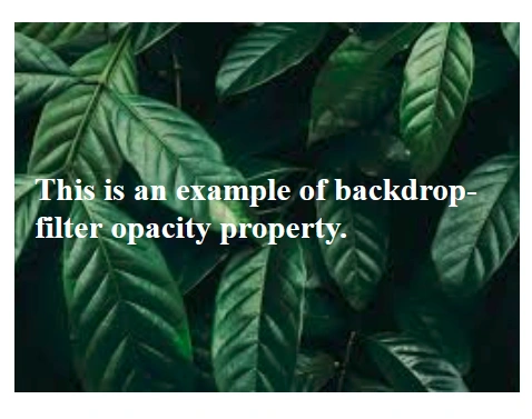
Example 7: backdrop-filter: opacity(40%);
<!DOCTYPE html>
<html lang="en">
<head>
<meta charset="UTF-8" />
<meta name="viewport" content="width=device-width, initial-scale=1.0" />
<title>Backdrop-Filter</title>
<style>
.container {
display: flex;
align-items: center;
justify-content: center;
height: 350px;
width: 250px;
background: url(img.jpg) no-repeat center;
}
.box {
padding: 10px;
font-weight: bold;
color: white;
background-color: transparent;
backdrop-filter: opacity(40%);
}
</style>
</head>
<body>
<div class="container">
<div class="box">
<p>This is an example of backdrop-filter opacity property.</p>
</div>
</div>
</body>
</html>
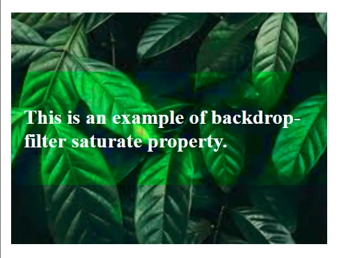
Example 8: backdrop-filter: saturate(4);
<!DOCTYPE html>
<html lang="en">
<head>
<meta charset="UTF-8" />
<meta name="viewport" content="width=device-width, initial-scale=1.0" />
<title>Backdrop-Filter</title>
<style>
.container {
display: flex;
align-items: center;
justify-content: center;
height: 350px;
width: 250px;
background: url(img.jpg) no-repeat center;
}
.box {
padding: 10px;
font-weight: bold;
color: white;
background-color: transparent;
backdrop-filter: saturate(4);
}
</style>
</head>
<body>
<div class="container">
<div class="box">
<p>This is an example of backdrop-filter saturate property.</p>
</div>
</div>
</body>
</html>
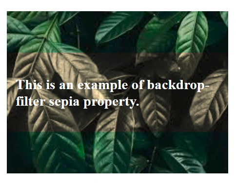
Example 9: backdrop-filter: sepia(90%);
<!DOCTYPE html>
<html lang="en">
<head>
<meta charset="UTF-8" />
<meta name="viewport" content="width=device-width, initial-scale=1.0" />
<title>Backdrop-Filter</title>
<style>
.container {
display: flex;
align-items: center;
justify-content: center;
height: 350px;
width: 250px;
background: url(img.jpg) no-repeat center;
}
.box {
padding: 10px;
font-weight: bold;
color: white;
background-color: transparent;
backdrop-filter: sepia(90%);
}
</style>
</head>
<body>
<div class="container">
<div class="box">
<p>This is an example of backdrop-filter sepia property.</p>
</div>
</div>
</body>
</html>
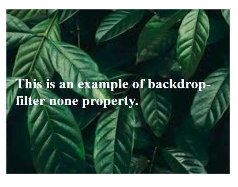
Example 10: backdrop-filter: none;
<!DOCTYPE html>
<html lang="en">
<head>
<meta charset="UTF-8" />
<meta name="viewport" content="width=device-width, initial-scale=1.0" />
<title>Backdrop-Filter</title>
<style>
.container {
display: flex;
align-items: center;
justify-content: center;
height: 350px;
width: 250px;
background: url(img.jpg) no-repeat center;
}
.box {
padding: 10px;
font-weight: bold;
color: white;
background-color: transparent;
backdrop-filter: none;
}
</style>
</head>
<body>
<div class="container">
<div class="box">
<p>This is an example of backdrop-filter none property.</p>
</div>
</div>
</body>
</html>
Blend Mode (mix-blend-mode)
The mix-blend-mode property determines how an element’s content blends with the background behind it.
This can be used to create visually striking effects by combining colors and textures in unique ways.
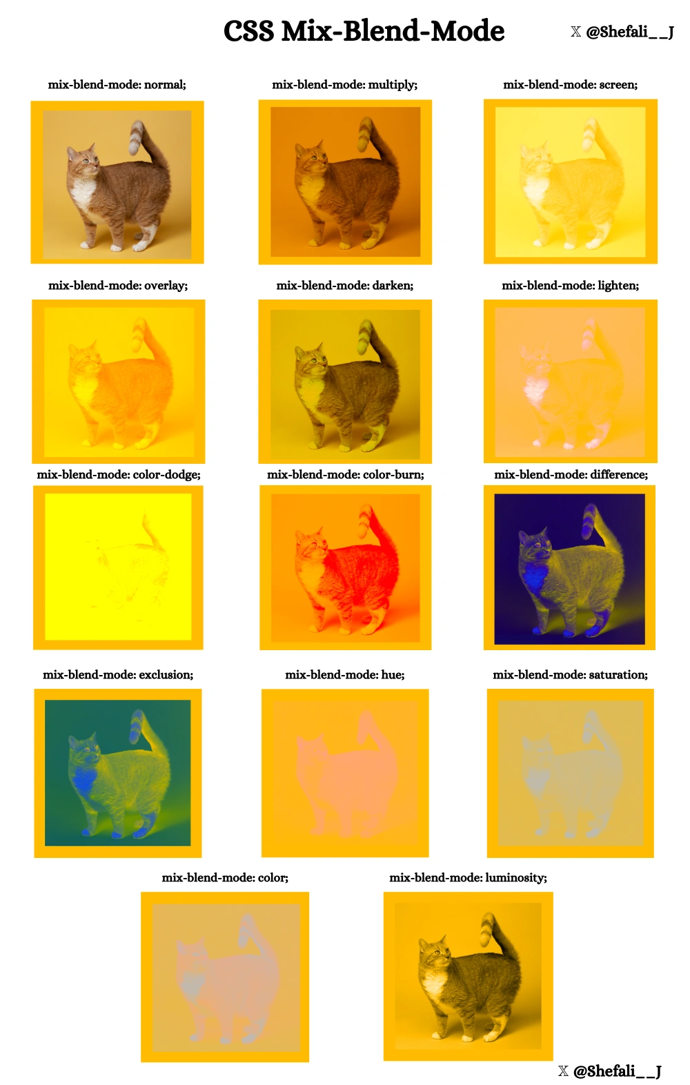
Examples with common values for mix-blend-mode
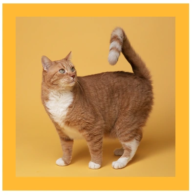
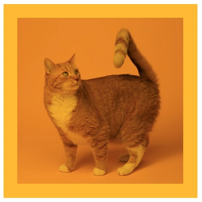
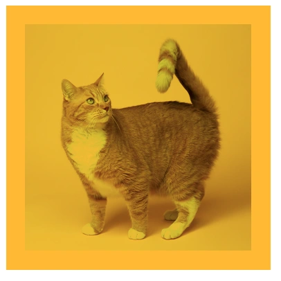
Example 1: mix-blend-mode: normal;
No blending is applied; the element appears as is.
<!DOCTYPE html>
<html lang="en">
<head>
<meta charset="UTF-8" />
<meta name="viewport" content="width=device-width, initial-scale=1.0" />
<title>Mix-Blend Mode</title>
<style>
div {
display: flex;
justify-content: center;
align-items: center;
width: 350px;
height: 350px;
background-color: rgb(255, 187, 0);
}
img {
width: 300px;
height: 300px;
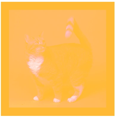
mix-blend-mode: normal;
}
</style>
</head>
<body>
<div>
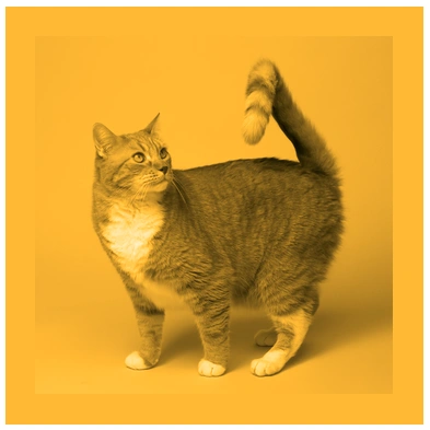
<img src="cat.jpg" alt="cat picture" />
</div>
</body>
</html>
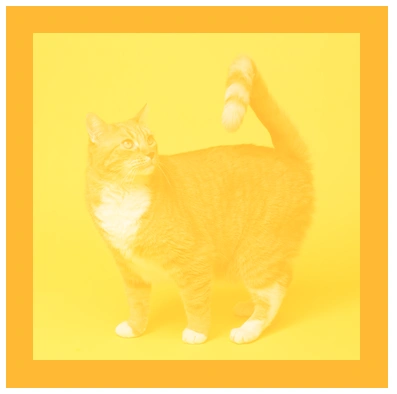
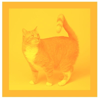
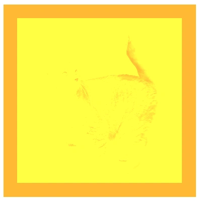
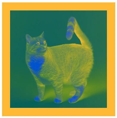
Example 2: mix-blend-mode: multiply;
It multiplies the colors of the element and the background, that makes a darker effect.
<!DOCTYPE html>
<html lang="en">
<head>
<meta charset="UTF-8" />
<meta name="viewport" content="width=device-width, initial-scale=1.0" />
<title>Mix-Blend Mode</title>
<style>
div {
display: flex;
justify-content: center;
align-items: center;
width: 350px;
height: 350px;
background-color: rgb(255, 187, 0);
}
img {
width: 300px;
height: 300px;
mix-blend-mode: multiply;
}
</style>
</head>
<body>
<div>
<img src="cat.jpg" alt="cat picture" />
</div>
</body>
</html>
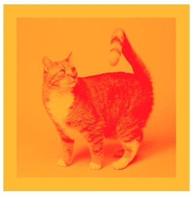
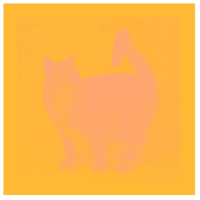
Example 3: mix-blend-mode: screen;
It combines the colors to make a lighter effect.
<!DOCTYPE html>
<html lang="en">
<head>
<meta charset="UTF-8" />
<meta name="viewport" content="width=device-width, initial-scale=1.0" />
<title>Mix-Blend Mode</title>
<style>
div {
display: flex;
justify-content: center;
align-items: center;
width: 350px;
height: 350px;
background-color: rgb(255, 187, 0);
}
img {
width: 300px;
height: 300px;
mix-blend-mode: screen;
}
</style>
</head>
<body>
<div>
<img src="cat.jpg" alt="cat picture" />
</div>
</body>
</html>
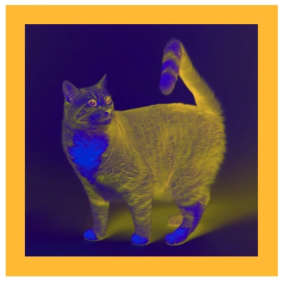
Example 4: mix-blend-mode: overlay;
This is a mixture of multiply and screen to create a contrasting effect.
<!DOCTYPE html>
<html lang="en">
<head>
<meta charset="UTF-8" />
<meta name="viewport" content="width=device-width, initial-scale=1.0" />
<title>Mix-Blend Mode</title>
<style>
div {
display: flex;
justify-content: center;
align-items: center;
width: 350px;
height: 350px;
background-color: rgb(255, 187, 0);
}
img {
width: 300px;
height: 300px;
mix-blend-mode: overlay;
}
</style>
</head>
<body>
<div>
<img src="cat.jpg" alt="cat picture" />
</div>
</body>
</html>
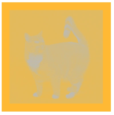
Example 5: mix-blend-mode: darken;
It keeps only the darkest colors.
<!DOCTYPE html>
<html lang="en">
<head>
<meta charset="UTF-8" />
<meta name="viewport" content="width=device-width, initial-scale=1.0" />
<title>Mix-Blend Mode</title>
<style>
div {
display: flex;
justify-content: center;
align-items: center;
width: 350px;
height: 350px;
background-color: rgb(255, 187, 0);
}
img {
width: 300px;
height: 300px;
mix-blend-mode: darken;
}
</style>
</head>
<body>
<div>
<img src="cat.jpg" alt="cat picture" />
</div>
</body>
</html>
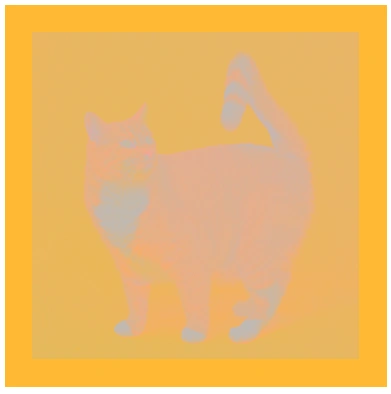
Example 6: mix-blend-mode: lighten;
It keeps only the lightest colors.
<!DOCTYPE html>
<html lang="en">
<head>
<meta charset="UTF-8" />
<meta name="viewport" content="width=device-width, initial-scale=1.0" />
<title>Mix-Blend Mode</title>
<style>
div {
display: flex;
justify-content: center;
align-items: center;
width: 350px;
height: 350px;
background-color: rgb(255, 187, 0);
}
img {
width: 300px;
height: 300px;
mix-blend-mode: lighten;
}
</style>
</head>
<body>
<div>
<img src="cat.jpg" alt="cat picture" />
</div>
</body>
</html>
Example 7: mix-blend-mode: color-dodge;
It brightens the background to reflect the blend color.
<!DOCTYPE html>
<html lang="en">
<head>
<meta charset="UTF-8" />
<meta name="viewport" content="width=device-width, initial-scale=1.0" />
<title>Mix-Blend Mode</title>
<style>
div {
display: flex;
justify-content: center;
align-items: center;
width: 350px;
height: 350px;
background-color: rgb(255, 187, 0);
}
img {
width: 300px;
height: 300px;
mix-blend-mode: color-dodge;
}
</style>
</head>
<body>
<div>
<img src="cat.jpg" alt="cat picture" />
</div>
</body>
</html>
Example 8: mix-blend-mode: color-burn;
It darkens the background to reflect the blend color.
<!DOCTYPE html>
<html lang="en">
<head>
<meta charset="UTF-8" />
<meta name="viewport" content="width=device-width, initial-scale=1.0" />
<title>Mix-Blend Mode</title>
<style>
div {
display: flex;
justify-content: center;
align-items: center;
width: 350px;
height: 350px;
background-color: rgb(255, 187, 0);
}
img {
width: 300px;
height: 300px;
mix-blend-mode: color-burn;
}
</style>
</head>
<body>
<div>
<img src="cat.jpg" alt="cat picture" />
</div>
</body>
</html>
Example 9: mix-blend-mode: difference;
This subtracts the colors and creates an inverted effect.
<!DOCTYPE html>
<html lang="en">
<head>
<meta charset="UTF-8" />
<meta name="viewport" content="width=device-width, initial-scale=1.0" />
<title>Mix-Blend Mode</title>
<style>
div {
display: flex;
justify-content: center;
align-items: center;
width: 350px;
height: 350px;
background-color: rgb(255, 187, 0);
}
img {
width: 300px;
height: 300px;
mix-blend-mode: difference;
}
</style>
</head>
<body>
<div>
<img src="cat.jpg" alt="cat picture" />
</div>
</body>
</html>
Example 10: mix-blend-mode: exclusion;
Similar to difference but with lower contrast.
<!DOCTYPE html>
<html lang="en">
<head>
<meta charset="UTF-8" />
<meta name="viewport" content="width=device-width, initial-scale=1.0" />
<title>Mix-Blend Mode</title>
<style>
div {
display: flex;
justify-content: center;
align-items: center;
width: 350px;
height: 350px;
background-color: rgb(255, 187, 0);
}
img {
width: 300px;
height: 300px;
mix-blend-mode: exclusion;
}
</style>
</head>
<body>
<div>
<img src="cat.jpg" alt="cat picture" />
</div>
</body>
</html>
Example 11: mix-blend-mode: hue;
Applies the hue of the blend color while keeping the background’s lightness and saturation.
<!DOCTYPE html>
<html lang="en">
<head>
<meta charset="UTF-8" />
<meta name="viewport" content="width=device-width, initial-scale=1.0" />
<title>Mix-Blend Mode</title>
<style>
div {
display: flex;
justify-content: center;
align-items: center;
width: 350px;
height: 350px;
background-color: rgb(255, 187, 0);
}
img {
width: 300px;
height: 300px;
mix-blend-mode: hue;
}
</style>
</head>
<body>
<div>
<img src="cat.jpg" alt="cat picture" />
</div>
</body>
</html>
Example 12: mix-blend-mode: saturation;
Applies the saturation of the blend color.
<!DOCTYPE html>
<html lang="en">
<head>
<meta charset="UTF-8" />
<meta name="viewport" content="width=device-width, initial-scale=1.0" />
<title>Mix-Blend Mode</title>
<style>
div {
display: flex;
justify-content: center;
align-items: center;
width: 350px;
height: 350px;
background-color: rgb(255, 187, 0);
}
img {
width: 300px;
height: 300px;
mix-blend-mode: saturation;
}
</style>
</head>
<body>
<div>
<img src="cat.jpg" alt="cat picture" />
</div>
</body>
</html>
Example 13: mix-blend-mode: color;
This applies the hue and saturation of the blend color, while keeping the lightness of the background.
<!DOCTYPE html>
<html lang="en">
<head>
<meta charset="UTF-8" />
<meta name="viewport" content="width=device-width, initial-scale=1.0" />
<title>Mix-Blend Mode</title>
<style>
div {
display: flex;
justify-content: center;
align-items: center;
width: 350px;
height: 350px;
background-color: rgb(255, 187, 0);
}
img {
width: 300px;
height: 300px;
mix-blend-mode: color;
}
</style>
</head>
<body>
<div>
<img src="cat.jpg" alt="cat picture" />
</div>
</body>
</html>
Example 14: mix-blend-mode: luminosity;
This applies the lightness of the blend color, while keeping the hue and saturation of the background.
<!DOCTYPE html>
<html lang="en">
<head>
<meta charset="UTF-8" />
<meta name="viewport" content="width=device-width, initial-scale=1.0" />
<title>Mix-Blend Mode</title>
<style>
div {
display: flex;
justify-content: center;
align-items: center;
width: 350px;
height: 350px;
background-color: rgb(255, 187, 0);
}
img {
width: 300px;
height: 300px;
mix-blend-mode: luminosity;
}
</style>
</head>
<body>
<div>
<img src="cat.jpg" alt="cat picture" />
</div>
</body>
</html>
Browser Support
- Supported in most modern browsers like Chrome, Edge, Firefox, and Safari.
- Ensure to test on older browsers or provide fallback styles if necessary.
Control Overflowed Text
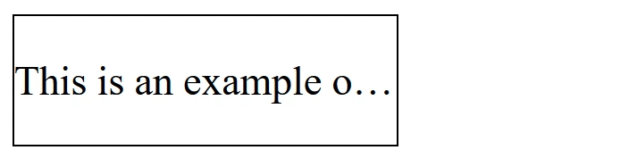
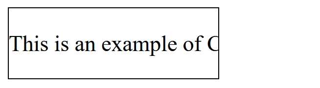
The text-overflow property in CSS is used to control how overflowed text is handled when it doesn't fit within the container's width.
It is particularly useful when you have limited space for text and want to add an ellipsis (...) or some other effect to indicate that the text is too long to be displayed fully.
Example 1:
<!DOCTYPE html>
<html lang="en">
<head>
<meta charset="UTF-8" />
<meta http-equiv="X-UA-Compatible" content="IE=edge" />
<meta name="viewport" content="width=device-width, initial-scale=1.0" />
<title>Text-overflow</title>
<style>
div {
width: 150px;
border: 1px solid black;
}
p {
white-space: nowrap; /* Prevent text from wrapping onto multiple lines */
overflow: hidden; /* Hide the overflowed text */
text-overflow: ellipsis; /* Add ellipsis (...) when the text overflows */
}
</style>
</head>
<body>
<div>
<p>This is an example of CSS text-overflow property.</p>
</div>
</body>
</html>
Example 2:
<!DOCTYPE html>
<html lang="en">
<head>
<meta charset="UTF-8" />
<meta http-equiv="X-UA-Compatible" content="IE=edge" />
<meta name="viewport" content="width=device-width, initial-scale=1.0" />
<title>Text-overflow</title>
<style>
div {
width: 150px;
border: 1px solid black;
}
p {
white-space: nowrap; /* Prevent text from wrapping onto multiple lines */
overflow: hidden; /* Hide the overflowed text */
text-overflow: clip; /* No ellipsis, just clip the text */
}
</style>
</head>
<body>
<div>
<p>This is an example of CSS text-overflow property.</p>
</div>
</body>
</html>
Use Cases for text-overflow
- Navigation bars: In small navigation links where the text may overflow, you can use this to keep the interface clean.
- Text truncation in UI: When you need to truncate long titles, descriptions, or other content while still signaling that there's more information.
- Responsive design: In designs where the container's size changes (like when resizing the browser),
text-overflowhelps maintain readability by ensuring text fits within the container.
Object-fit
The object-fit property in CSS allows you to control how an image or video behaves when it is resized to fit within its container.
This property is useful when working with media like images or videos that need to fit in a specific space, while maintaining their aspect ratio or filling the entire container.
Common Values
contain:
The content will scale to fit the container while maintaining its aspect ratio. The entire content will be visible, but the container may have empty space (e.g., padding) around it.
cover:
The content is resized to completely cover the container, while maintaining its aspect ratio. The content will be cropped if the container’s aspect ratio does not match the content’s.
scale-down:
The content is scaled down to fit within the container, but it will only be reduced if necessary. This means if the content is smaller than the container, it will not be scaled up.
fill:
The content is resized to completely fill the container, potentially distorting the aspect ratio of the content. This is the default behavior when object-fit is not set.
none:
The content retains its original size and does not scale to fit the container. If the content is larger than the container, it will overflow.
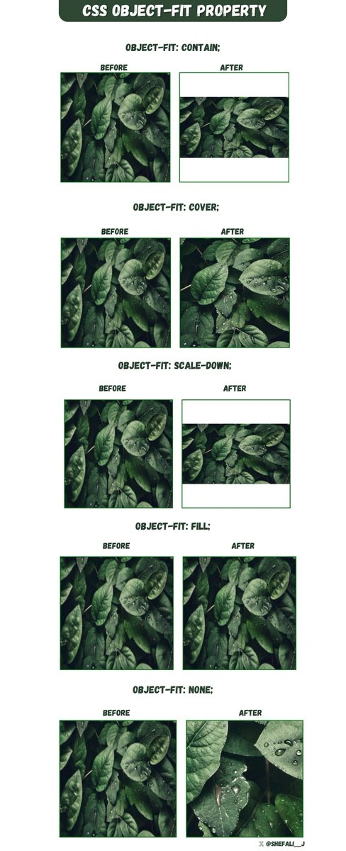
By using object-fit, you can create responsive designs that adapt to different screen sizes and containers without distorting the images or videos.
Object-position
The object-position property is used with object-fit property to control how an image or video should be positioned inside its container when it is resized or cropped.
The object-position property allows you to specify the position of the content (image or video) within its content box using x/y coordinates or keywords like top, bottom, left, right, or any combination of these.
Syntax:
object-position: position;position: This can be a keyword or a set of values representing the horizontal and vertical positions. The default is center for both axes.
Common Values
center: Centers the image within the container (both horizontally and vertically).top,bottom,left,right: Positions the image relative to the edges of the container.x% y%: You can use percentage values to position the image. For example,50% 50%centers the image in both directions.
Example 1
<!DOCTYPE html>
<html lang="en">
<head>
<meta charset="UTF-8" />
<meta http-equiv="X-UA-Compatible" content="IE=edge" />
<meta name="viewport" content="width=device-width, initial-scale=1.0" />
<title>Object-position</title>
<style>
div {
width: 500px;
height: 400px;
border: 3px solid rgb(236, 221, 6);
}
img {
width: 500px;
height: 300px;
object-fit: cover;
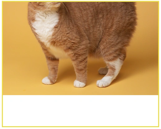
object-position: bottom right;
}
</style>
</head>
<body>
<div>
<img src="cat.jpg" alt="cat picture" />
</div>
</body>
</html>
Example 2
<!DOCTYPE html>
<html lang="en">
<head>
<meta charset="UTF-8" />
<meta http-equiv="X-UA-Compatible" content="IE=edge" />
<meta name="viewport" content="width=device-width, initial-scale=1.0" />
<title>Object-position</title>
<style>
div {
width: 500px;
height: 400px;
border: 3px solid rgb(236, 221, 6);
}
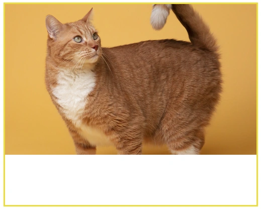
img {
width: 500px;
height: 300px;
object-fit: cover;
object-position: center;
}
</style>
</head>
<body>
<div>
<img src="cat.jpg" alt="cat picture" />
</div>
</body>
</html>
Example 3
<!DOCTYPE html>
<html lang="en">
<head>
<meta charset="UTF-8" />
<meta http-equiv="X-UA-Compatible" content="IE=edge" />
<meta name="viewport" content="width=device-width, initial-scale=1.0" />
<title>Object-position</title>
<style>
div {
width: 500px;
height: 400px;
border: 3px solid rgb(236, 221, 6);
}
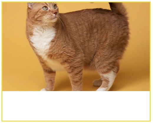
img {
width: 500px;
height: 300px;
object-fit: cover;
object-position: 25% 75%; /* Positions the image at 25% from the left and 75% from the top */
}
</style>
</head>
<body>
<div>
<img src="cat.jpg" alt="cat picture" />
</div>
</body>
</html>
By using object-position in combination with object-fit, you can create more flexible, responsive layouts where images maintain their aspect ratio while being positioned as desired within their containers.
More tips
Explore more practical CSS tips and tricks in my curated guide:
👉 Next tutorial: CSS Responsive Design