What is CSS Grid?
CSS Grid is a powerful layout system that allows you to create complex and responsive web layouts with ease. By using the CSS grid, you can place and align elements precisely within a two-dimensional grid structure.
In simple terms, by using CSS Grid you can organize and align web page elements (like text, images, and buttons) in rows and columns, making it easier to create beautiful and responsive web layouts, that look great on all devices (mobile, tablet and desktop).
Some Important Grid Terminologies
Before diving deep into grid layout you should first know about some grid terminologies.
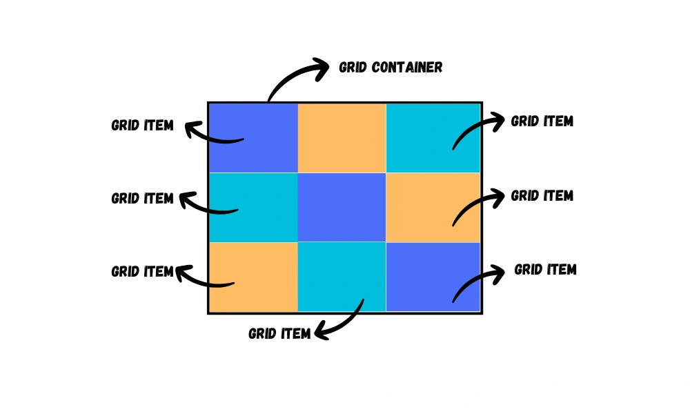
Grid Container
The element which has the display: grid property on it, is called grid container.
Grid Item
The direct child element of a grid container is called the grid item.
For example:
<div class="container">
<div class="item">
<div class="box"></div>
</div>
</div>CSS:
.container {
display: grid;
}Here, the <div> element with the class 'container' is a grid container because it has the display: grid; property.
The second <div> element with the class 'item' is a grid item because it is the direct child of the grid container.
Now, will the <div> element with the class 'box' be considered a grid item or not?
The answer is no. It will not be considered a grid item because it is not a direct child element of the grid container.
For an element to be a grid item it must be the direct child of the grid container.
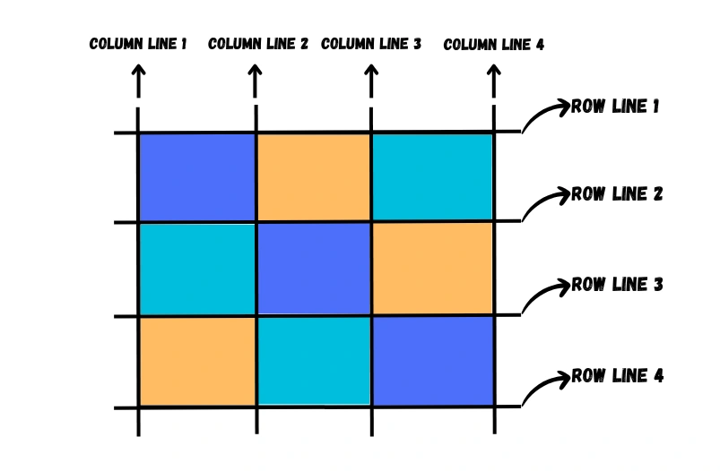
Grid Line
The lines that separate the rows and columns of the grid are grid lines.
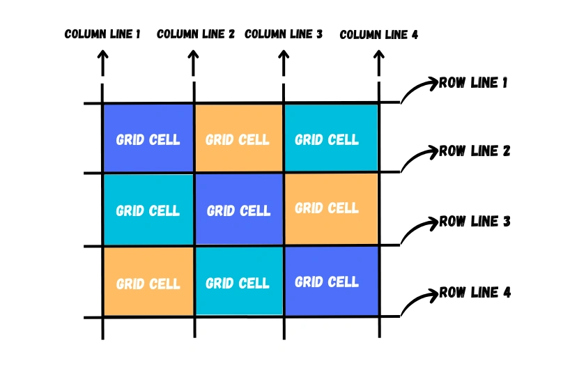
Grid Cell
A grid cell is a single unit of the grid, which is created by the intersection of a row and a column.
Now you might be thinking what is the difference between a grid cell and a grid item?
Let me clear this.
A grid cell is a structural component, representing the intersection of rows and columns, while a grid item is a content or element that is positioned within one or more grid cells. Grid cells define the grid's structure, and grid items are the elements you place within that structure.
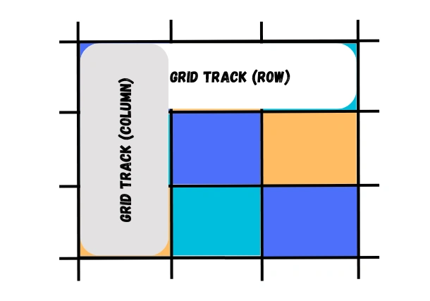
Grid Track
The space between two adjacent grid lines is a grid track. It can be horizontal(row) or vertical(column).
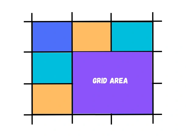
Grid Area
A rectangular group of grid cells surrounded by four grid lines is called a grid area. A grid area can contain any number of grid cells.
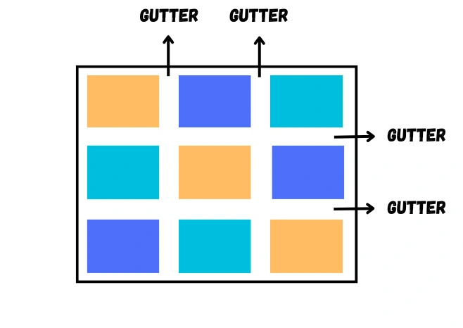
Gutter
The space between rows and columns in a grid is called gutter.
The fr Unit
Fr is a fractional unit and is used to distribute available space proportionally among grid items. 1fr is for 1 part of the available space.
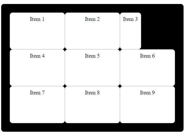
Grid Properties
We have the following properties for the grid container and grid items.
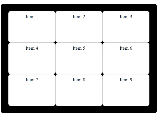
For all the properties I will use the following HTML and CSS structure.
HTML:
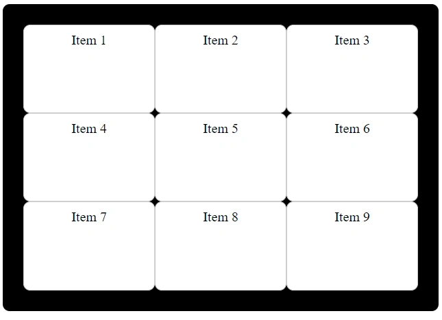
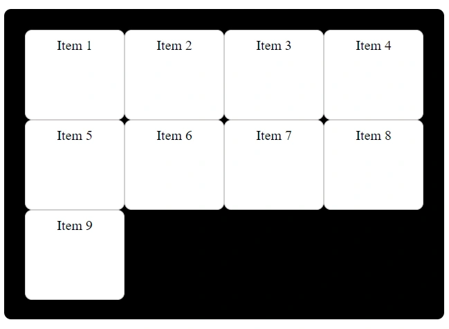
<div class="container">
<div class="item">Item 1</div>
<div class="item">Item 2</div>
<div class="item">Item 3</div>
<div class="item">Item 4</div>
<div class="item">Item 5</div>
<div class="item">Item 6</div>
<div class="item">Item 7</div>
<div class="item">Item 8</div>
<div class="item">Item 9</div>
</div>CSS:
.container {
width: 30vw;
background-color: #000;
padding: 30px;
border-radius: 10px;
}
.item {
background-color: #fff;
border: 1px solid rgb(209, 207, 207);
text-align: center;
padding: 10px;
border-radius: 10px;
font-size: 20px;
}Properties For Grid Container
The following properties are related to the grid container itself which allows you to define the structure and behavior of the grid layout.
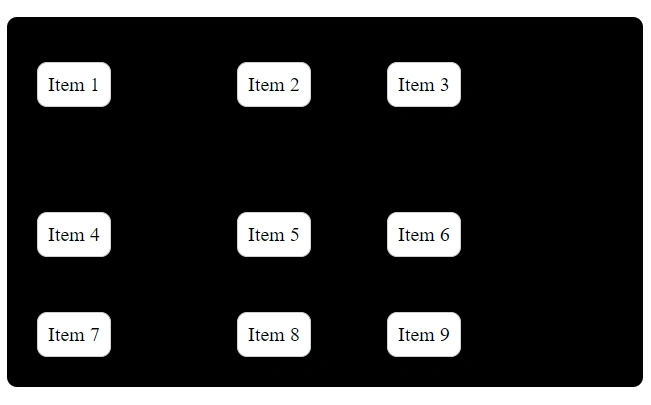
display
To create a grid layout, you can apply the display: grid; property to an HTML element. This element becomes the grid container, and its direct children elements are treated as grid items.
.container {
display: grid;
}grid-template-columns
This property is used to define the size and number of grid columns in the grid layout.
Example: 1
.container {
display: grid;
grid-template-columns: 100px 200px;
}This will create two columns one of 100px width and the second of 200px width.
Example: 2
.container {
display: grid;
grid-template-columns: 100px 150px 1fr;
}This will create three columns one of 100px width, the second of 150px width and the third column relative to the fraction of available space in the grid container.
Example: 3
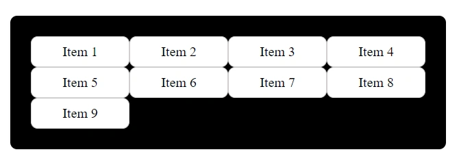
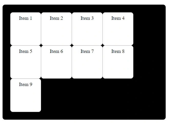
If you want your grid columns to have the same width then you can use the value 'auto'.
The auto keyword lets the browser determine the size of a track based on its content and available space.
.container {
display: grid;
grid-template-columns: auto auto auto auto;
}This will create four columns of the same width.
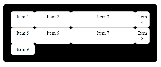
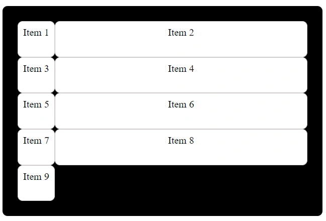
Example: 4
.container {
display: grid;
grid-template-columns: 100px 150px auto 60px;
}
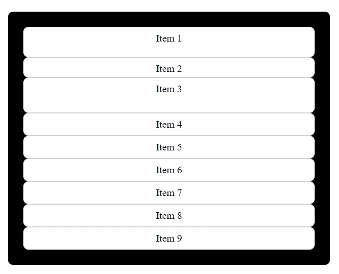
grid-template-rows
This property is used to define the size and number of grid rows in the grid layout.
Example: 1
.container {
display: grid;
grid-template-rows: 60px 40px 70px;
}This will create the first row of 60px height, the second row of 40px height and the third row of 70px height.
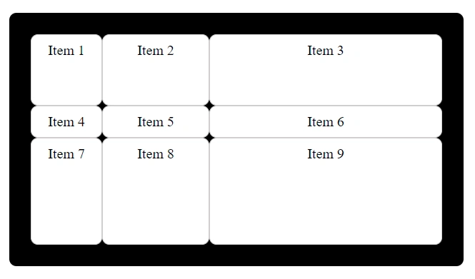
Example: 2
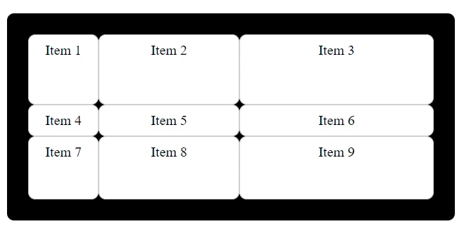
.container {
display: grid;
grid-template-rows: 100px 1fr 150px;
grid-template-columns: 100px 150px 1fr;
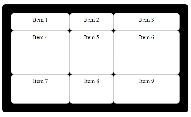
}This will create three rows one of 100px height, the second is relative to the fraction of available space in the grid container and the third is of 150px height.
This will be a grid container of 3 rows and 3 columns.
Example: 3
Let's create a grid layout of 4 rows and 4 columns.
.container {
display: grid;
grid-template-rows: 100px auto 150px auto;
grid-template-columns: 100px auto 50px auto;
}
grid-template
This property is a shorthand property for defining both the grid-template-rows and grid-template-columns in a single declaration.
Basic syntax:
grid-template: grid-template-rows / grid-template-columns;For example:
.container {
display: grid;
grid-template: 100px 1fr 2fr / 100px 200px 1fr;
}
Here, we have a grid layout of 3 rows and 3 columns.
grid-auto-columns
You can set a default size for grid columns using grid-auto-columns property.
grid-template-columns property overrides grid-auto-columns property.
.container {
display: grid;
grid-auto-columns: 100px;
}grid-auto-rows
You can set a default size for grid rows using grid-auto-rows property.
grid-template-rows property overrides grid-auto-rows property.
.container {
display: grid;
grid-auto-rows: 70px;
}column-gap
This property is used to define the gap between the columns of the grid container.
.container {
display: grid;
grid-template-columns: 100px 100px 1fr;
column-gap: 15px;
}
row-gap
This property is used to define the gap between the rows of the grid container.
.container {
display: grid;
grid-template-rows: 50px 40px 1fr;
grid-template-columns: 100px 150px 1fr;
row-gap: 15px;
}
gap
This property is a shorthand for defining both row-gap and column-gap in a single declaration.
Syntax:
gap: row-gap column-gap;The values are space-separated.
Example:
.container {
display: grid;
grid-template-rows: 100px 100px 1fr;
grid-template-columns: 100px 100px 1fr;
gap: 10px 20px; /*first value is for row-gap and second value is for column-gap*/
}
justify-items
This property is used to control the horizontal alignment (along the row axis) of grid items.
It has the following values:
- start
- end
- center
- stretch
start
This aligns the items to the start of the grid column.
.container {
display: grid;
grid-template-columns: 200px 150px 1fr;
grid-template-rows: 60px 1fr 100px;
justify-items: start;
}
end
This aligns the items to the end of the grid column.
.container {
display: grid;
grid-template-columns: 200px 150px 1fr;
grid-template-rows: 60px 1fr 100px;
justify-items: end;
}
center
This centers the items horizontally within the grid column.
.container {
display: grid;
grid-template-columns: 200px 150px 1fr;
grid-template-rows: 60px 1fr 100px;
justify-items: center;
}
stretch
This stretches the items to fill the entire width of the grid column. This is the default value.
.container {
display: grid;
grid-template-columns: 200px 150px 1fr;
grid-template-rows: 60px 1fr 100px;
justify-items: stretch;
}
align-items
This property is used to control the vertical alignment (along the column axis) of grid items.
It has the following values:
- start
- end
- center
- stretch
start
This aligns the items to the top of the grid row.
.container {
display: grid;
grid-template-columns: 200px 150px 1fr;
grid-template-rows: 60px 150px 100px;
align-items: start;
}
end
This aligns the items to the bottom of the grid row.
.container {
display: grid;
grid-template-columns: 200px 150px 1fr;
grid-template-rows: 60px 150px 100px;
align-items: end;
}
center
This centers the items vertically within the grid row.
.container {
display: grid;
grid-template-columns: 200px 150px 1fr;
grid-template-rows: 60px 150px 100px;
align-items: center;
}
stretch
This stretches the items to fill the entire height of the grid row. This is the default value.
.container {
display: grid;
grid-template-columns: 200px 150px 1fr;
grid-template-rows: 60px 150px 100px;
align-items: stretch;
}
place-items
This property is a shorthand for setting both align-items and justify-items in a single declaration.
Basic syntax:
place-items: align-items justify-items;The values are space-separated.
Example: 1
.container {
display: grid;
grid-template-columns: 200px 150px 1fr;
grid-template-rows: 60px 150px 100px;
place-items: start; /*Both values are set to start*/
}
Example: 2
.container {
display: grid;
grid-template-columns: 200px 150px 1fr;
grid-template-rows: 60px 150px 100px;
place-items: end; /*Both values are set to end*/
}
Example: 3
.container {
display: grid;
grid-template-columns: 200px 150px 1fr;
grid-template-rows: 60px 150px 100px;
place-items: start stretch; /*first value is for align-items and second is for justify-items*/
}
Example: 4
.container {
display: grid;
grid-template-columns: 200px 150px 1fr;
grid-template-rows: 60px 150px 100px;
place-items: end start; /*first value is for align-items and second is for justify-items*/
}
You can try different combinations as well with different values of align-items and justify-items.
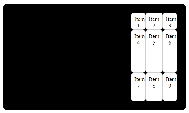
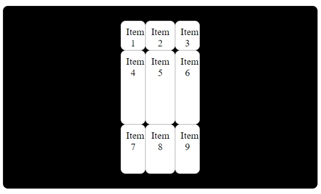
justify-content
This property is used to control the horizontal alignment (along the row axis) of all the grid content if the total grid size is smaller than the container.
It has the following values:
- start
- end
- center
- space-around
- space-between
- space-evenly
start
Items are aligned to the start of the container.
.container {
display: grid;
grid-template-columns: 50px 60px 50px; /*To make the total size of the grid smaller than the container*/
grid-template-rows: 60px 150px 100px;
justify-content: start;
}
end
Items are aligned to the end of the container.
.container {
display: grid;
grid-template-columns: 50px 60px 50px;
grid-template-rows: 60px 150px 100px;
justify-content: end;
}
center
Items are aligned to the center of the container.
.container {
display: grid;
grid-template-columns: 50px 60px 50px;
grid-template-rows: 60px 150px 100px;
justify-content: center;
}
space-between
Items are evenly distributed with equal space between them and the first item at the start and the last item at the end of the container.
.container {
display: grid;
grid-template-columns: 50px 60px 50px;
grid-template-rows: 60px 150px 100px;
justify-content: space-between;
}
space-around
Items are evenly distributed with equal space around them.
.container {
display: grid;
grid-template-columns: 50px 60px 50px;
grid-template-rows: 60px 150px 100px;
justify-content: space-around;
}
space-evenly
Items are evenly distributed with equal space around and between them.
.container {
display: grid;
grid-template-columns: 50px 60px 50px;
grid-template-rows: 60px 150px 100px;
justify-content: space-evenly;
}
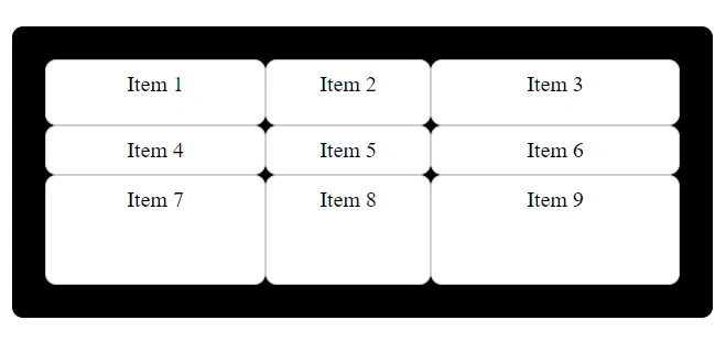
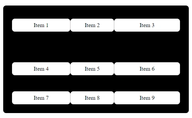
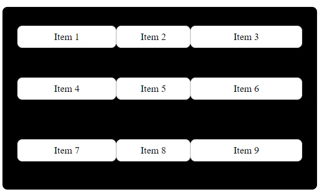
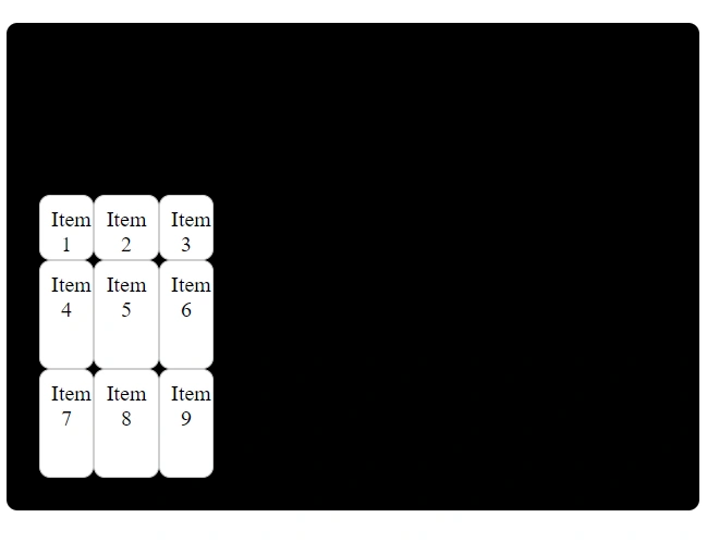
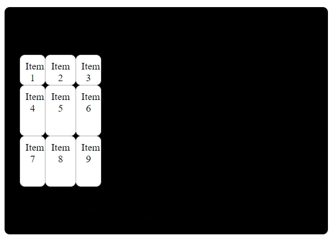
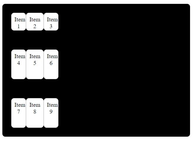
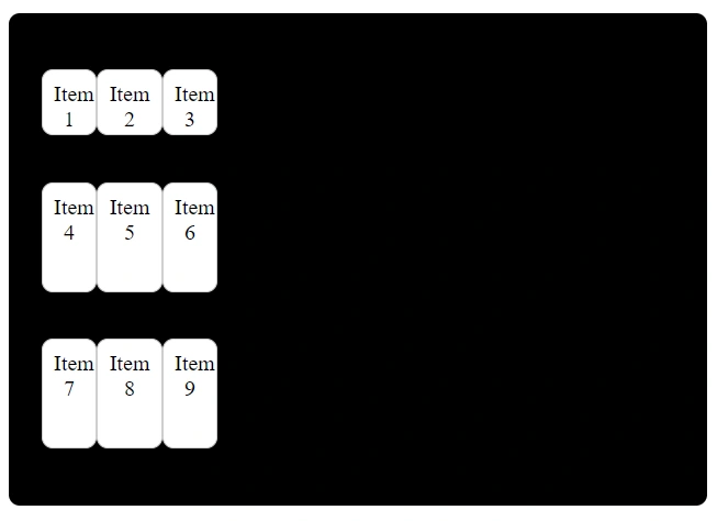
align-content
This property is used to control the vertical alignment (along the column axis) of all the grid content if the total grid size is smaller than the container.
It has the following values:
- start
- end
- center
- space-around
- space-between
- space-evenly
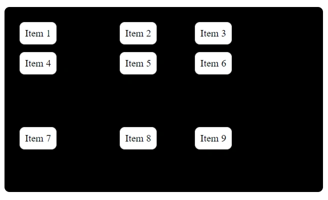
start
Rows are aligned to the start of the container.
To see it even clearer, I’ve added height to the container.
.container {
display: grid;
height: 40vh;
grid-template-columns: 50px 60px 50px;
grid-template-rows: 60px 100px 100px;
align-content: start;
}
end
Rows are aligned to the end of the container.
.container {
display: grid;
height: 40vh;
grid-template-columns: 50px 60px 50px;
grid-template-rows: 60px 100px 100px;
align-content: end;
}
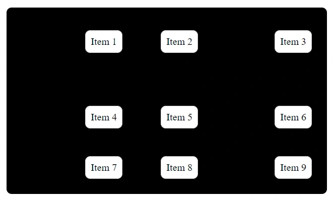
center
Rows are aligned to the center of the container.
.container {
display: grid;
height: 40vh;
grid-template-columns: 50px 60px 50px;
grid-template-rows: 60px 100px 100px;
align-content: center;
}
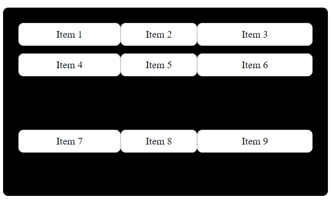
space-between
Rows are evenly distributed with equal space between them and the first row at the start and the last row at the end.
.container {
display: grid;
height: 40vh;
grid-template-columns: 50px 60px 50px;
grid-template-rows: 60px 100px 100px;
align-content: space-between;
}
space-around
Rows are evenly distributed with equal space around them.
.container {
display: grid;
height: 40vh;
grid-template-columns: 50px 60px 50px;
grid-template-rows: 60px 100px 100px;
align-content: space-around;
}
space-evenly
Rows are evenly distributed with equal space around and between them.
.container {
display: grid;
height: 40vh;
grid-template-columns: 50px 60px 50px;
grid-template-rows: 60px 100px 100px;
align-content: space-evenly;
}

place-content
This property is a shorthand for setting both align-content and justify-content in a single declaration.
Basic syntax:
place-content: align-content justify-content;The values are space-separated.
Example: 1
.container {
display: grid;
grid-template-columns: 50px 60px 50px;
grid-template-rows: 60px 100px 100px;
place-content: start space-evenly; /*first value is for align-content and second is for justify-content*/
}
Example: 2
.container {
display: grid;
grid-template-columns: 50px 60px 50px;
grid-template-rows: 60px 100px 100px;
place-content: space-between end;
}
You can try different combinations as well with different values of align-content and justify-content.
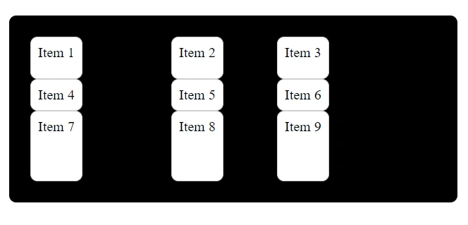
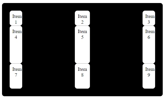
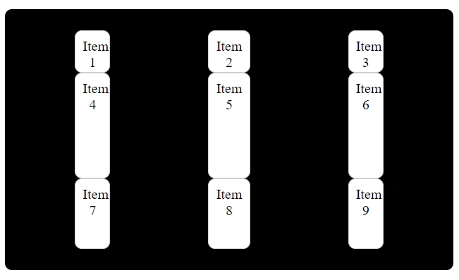
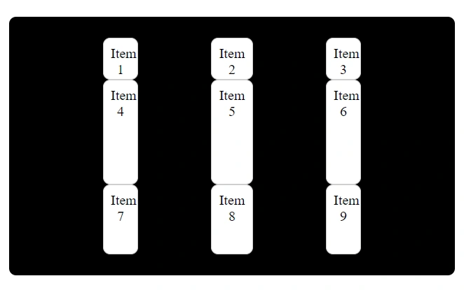
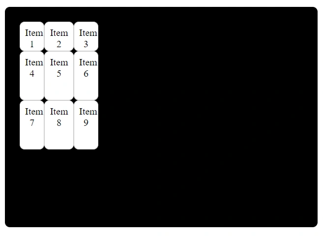
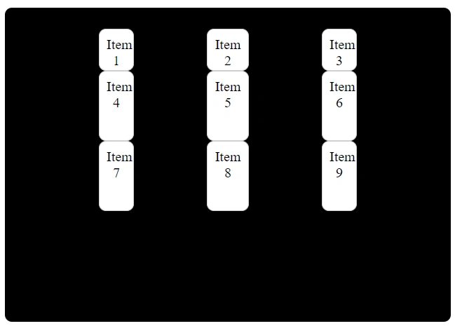
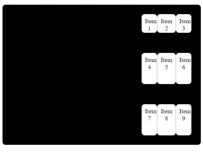
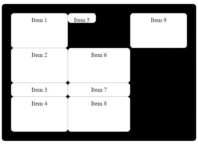
grid-auto-flow
This property is used to determine how additional grid items will be placed within the grid container when they are not explicitly positioned.
But, what does it mean by explicitly positioned?
Explicitly positioned items are the items that you define using the grid-template-columns or grid-template-rows property.
We have the following values for the grid-auto-flow property:
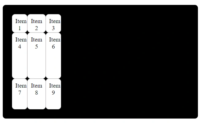
grid-auto-flow: column;
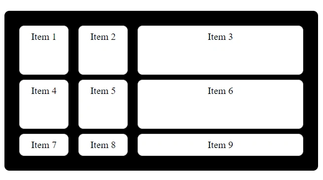
This value arranges grid items in columns, occupying each column before proceeding to the next one.
.container {
display: grid;
grid-auto-flow: column;
grid-template-rows: 1fr 1fr 1fr 1fr;
}
You can understand it more clearly by adding and removing the grid-auto-flow property.
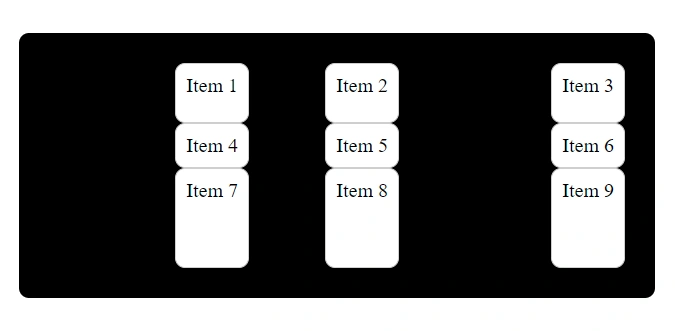
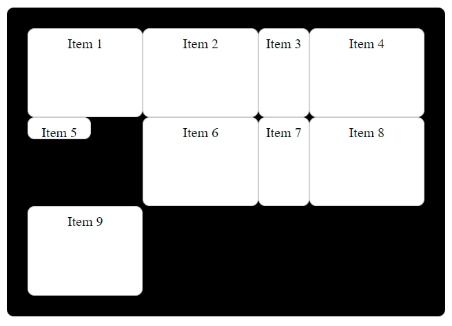
grid-auto-flow: row; (default)
This value arranges grid items in rows, occupying each row before proceeding to the next one.
.container {
display: grid;
grid-auto-flow: row;
grid-template-columns: 1fr 1fr auto 1fr;
}
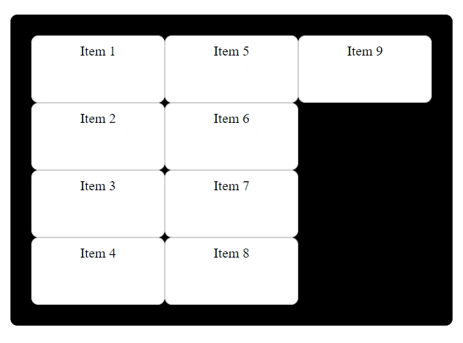
grid-auto-flow: column dense;
This value arranges grid items in columns, but it can leave empty spaces within the grid when smaller items are encountered subsequently.
.container {
display: grid;
grid-auto-flow: column dense;
grid-template-rows: 1fr 1fr auto 1fr;
}
.item:nth-child(5) {
height: 10px;
width: 70px;
}
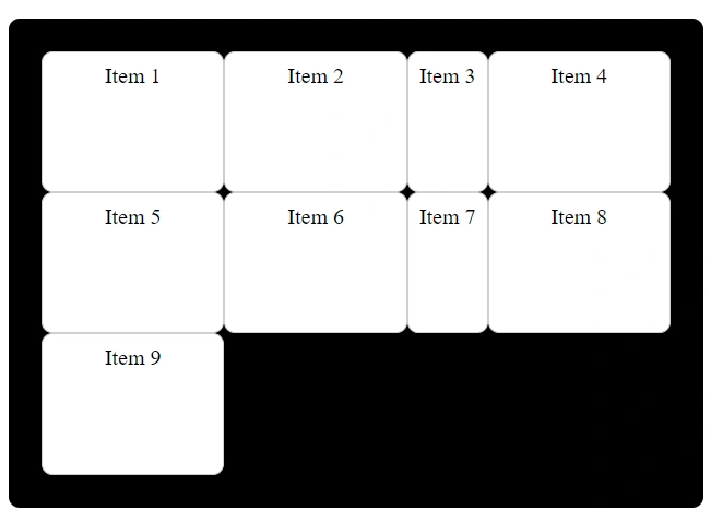
grid-auto-flow: row dense;
This value arranges grid items in rows, but it can leave empty spaces within the grid when smaller items are encountered subsequently.
.container {
display: grid;
grid-auto-flow: row dense;
grid-template-columns: 1fr 1fr auto 1fr;
}
.item:nth-child(5) {
height: 10px;
width: 70px;
}
Properties For Grid Items
The following properties are used to control the placement and alignment of individual grid items within a grid container.
justify-self
This property is used to control the horizontal alignment of a specific grid item within its grid cell. It overrides the horizontal alignment set for the entire grid container.
It has the following values:
- start
- end
- center
- stretch
start
This aligns the item to the start of its grid cell.
.container {
display: grid;
grid-template-columns: 1fr 1fr 1fr;
}
.item:nth-child(3) {
justify-self: start;
}
end
This aligns the item to the end of its grid cell.
.container {
display: grid;
grid-template-columns: 1fr 1fr 1fr;
}
.item:nth-child(3) {
justify-self: end;
}
center
This centers the item horizontally within its grid cell.
.container {
display: grid;
grid-template-columns: 1fr 1fr 1fr;
}
.item:nth-child(3) {
justify-self: center;
}
stretch
This stretches the item to fill the entire width of its grid cell.
.container {
display: grid;
grid-template-columns: 1fr 1fr 1fr;
}
.item:nth-child(3) {
justify-self: stretch;
}
align-self
This property is used to control the vertical alignment of a specific grid item within its grid cell. It overrides the vertical alignment set for the entire grid container.
It has the following values:
- start
- end
- center
- stretch
start
This aligns the item to the top of its grid cell.
.container {
display: grid;
grid-template-columns: 1fr 1fr 1fr;
}
.item:nth-child(3) {
align-self: start;
}
end
This aligns the item to the bottom of its grid cell.
.container {
display: grid;
grid-template-columns: 1fr 1fr 1fr;
}
.item:nth-child(3) {
align-self: end;
}
center
This centers the item vertically within its grid cell.
.container {
display: grid;
grid-template-columns: 1fr 1fr 1fr;
}
.item:nth-child(3) {
align-self: center;
}
stretch
This stretches the item to fill the entire height of its grid cell.
.container {
display: grid;
grid-template-columns: 1fr 1fr 1fr;
}
.item:nth-child(3) {
align-self: stretch;
}
place-self
This property is a shorthand for setting both align-self and justify-self in a single declaration.
Basic syntax:
place-self: align-self justify-self;The values are space-separated.
Example: 1
.container {
display: grid;
grid-template-columns: 1fr 1fr 1fr;
}
.item:nth-child(3) {
place-self: start end; /*first value is for align-self and second is for justify-self*/
}
Example: 2
.container {
display: grid;
grid-template-columns: 1fr 1fr 1fr;
}
.item:nth-child(3) {
place-self: stretch start; /*first value is for align-self and second is for justify-self*/
}
You can try different combinations as well with different values of align-self and justify-self.
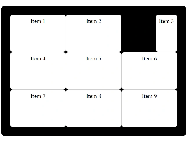
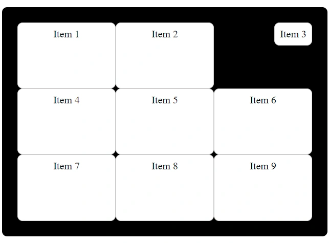
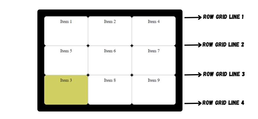
grid-row-start
This property is used to define where a grid item starts in a row.
.container {
display: grid;
grid-template-columns: 1fr 1fr 1fr;
}
.item:nth-child(3) {
grid-row-start: 3;
background-color: rgb(209, 209, 86);
}Here, the third grid item will start at the row grid line 3.
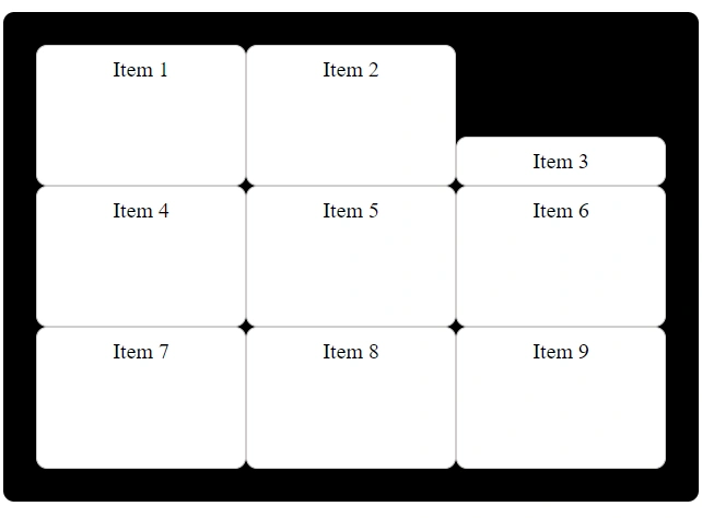
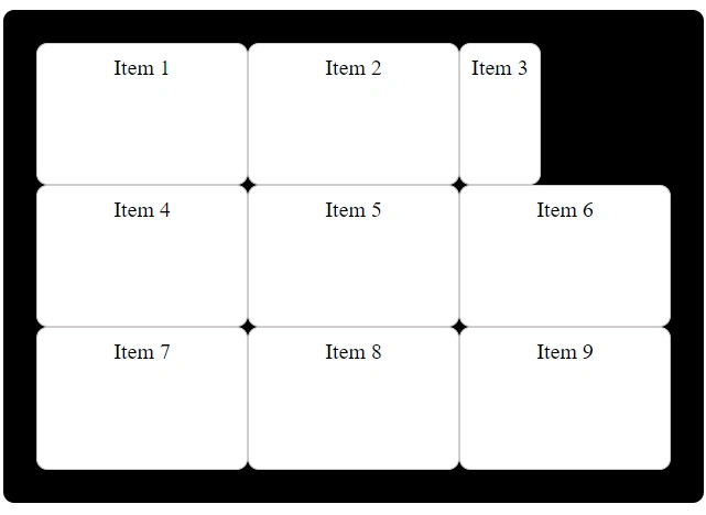
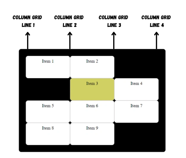
grid-column-start
This property is used to define where a grid item starts in a column.
.container {
display: grid;
grid-template-columns: 1fr 1fr 1fr;
}
.item:nth-child(3) {
grid-column-start: 2;
background-color: rgb(209, 209, 86);
}Here, the third grid item will start at column grid line 2.
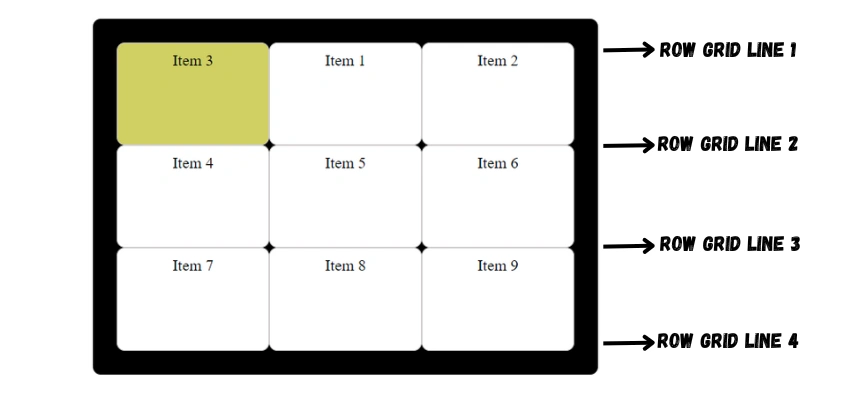
grid-row-end
This property is used to define where a grid item ends in a row.
.container {
display: grid;
grid-template-columns: 1fr 1fr 1fr;
}
.item:nth-child(3) {
grid-row-end: 2;
background-color: rgb(209, 209, 86);
}Here, the third grid item will end at the row grid line 2.
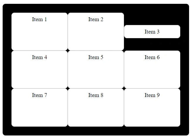
grid-column-end
This property is used to define where a grid item ends in a column.
.container {
display: grid;
grid-template-columns: 1fr 1fr 1fr;
}
.item:nth-child(3) {
grid-column-end: 3;
background-color: rgb(209, 209, 86);
}Here, the third grid item will end at column grid line 3.

Examples for grid-row-start, grid-column-start, grid-row-end and grid-column-end
Example: 1
.container {
display: grid;
grid-template-columns: 1fr 1fr 1fr;
}
.item:nth-child(3) {
grid-column-end: 3;
grid-column-start: 1;
background-color: rgb(209, 209, 86);
}Here, the third grid item will start at column grid line 1 and end at column grid line 3.
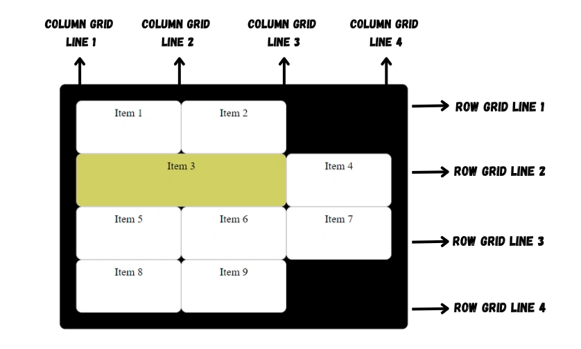
Example: 2
.container {
display: grid;
grid-template-columns: 1fr 1fr 1fr;
}
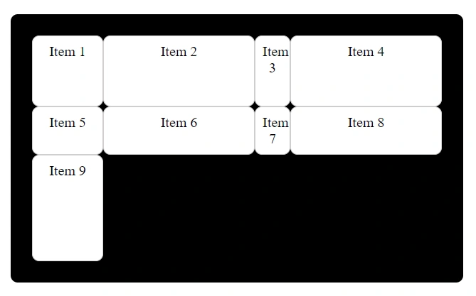
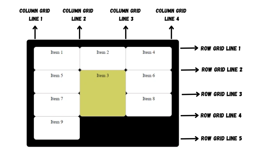
.item:nth-child(3) {
grid-row-start: 2;
grid-row-end: 4;
grid-column-end: 3;
background-color: rgb(209, 209, 86);
}Here, the third grid item will start at column grid line 1 and end at column grid line 3.
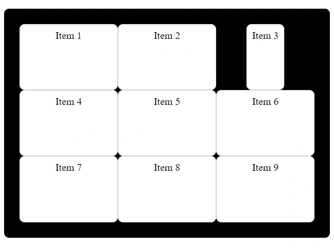
grid-row
This property is a shorthand for setting both grid-row-start and grid-row-end in a single declaration.
Basic syntax:
grid-row: grid-row-start / grid-row-end;Example:
.container {
display: grid;
grid-template-columns: 1fr 1fr 1fr;
}
.item:nth-child(3) {
grid-row: 3 / 4;
background-color: rgb(209, 209, 86);
}Here, the third item starts at row grid line 3 and ends at row grid line 4.

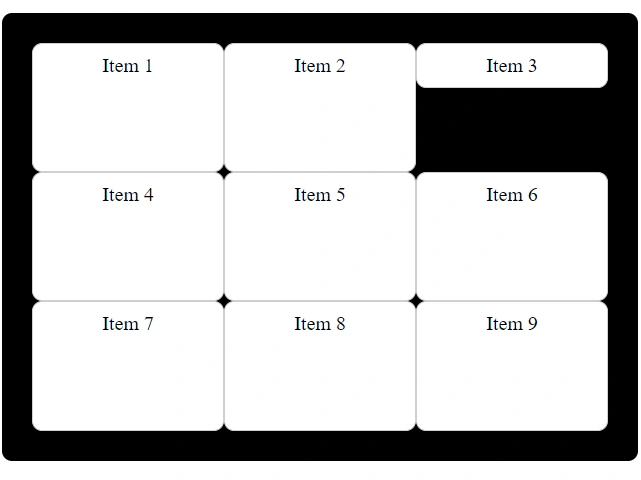
grid-column
This property is a shorthand for setting both grid-column-start and grid-column-end in a single declaration.
Basic syntax:
grid-column: grid-column-start / grid-column-end;Example:
.container {
display: grid;
grid-template-columns: 1fr 1fr 1fr;
}
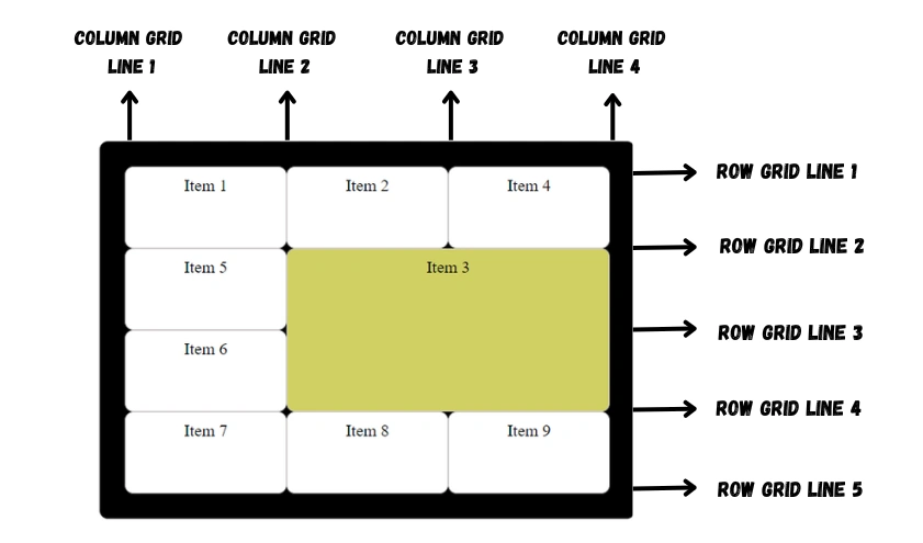
.item:nth-child(3) {
grid-column: 2 / 3;
background-color: rgb(209, 209, 86);
}Here, the third item starts at column grid line 2 and ends at column grid line 3.

grid-area
This property is a shorthand property for grid-row-start, grid-column-start, grid-row-end and grid-column-end.
This property can also be used to assign a name to a grid item. Then these named grid items can be referenced to the grid-template-areas property of the grid container.
Basic syntax:
grid-area: grid-row-start / grid-column-start / grid-row-end / grid-column-end | griditemname;Example: 1
.container {
display: grid;
grid-template-columns: 1fr 1fr 1fr;
}
.item:nth-child(3) {
grid-area: 2 / 4 / 4 / 2;
background-color: rgb(209, 209, 86);
}
Example: 2
.container {
display: grid;
grid-template-columns: 1fr 1fr 1fr;
}
.item:nth-child(3) {
grid-area: myGridArea;
background-color: rgb(209, 209, 86);
}grid-template-areas
This property defines the overall structure of the grid layout by specifying the arrangement of named grid areas.
Example:
HTML:
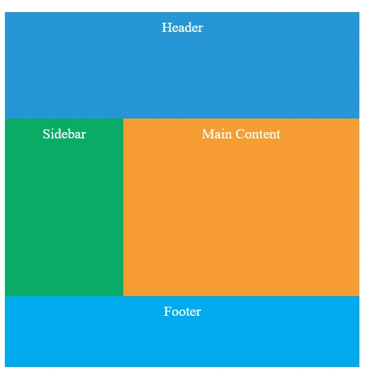
<div class="container">
<div class="item header">Header</div>
<div class="item sidebar">Sidebar</div>
<div class="item main">Main Content</div>
<div class="item footer">Footer</div>
</div>CSS:
.item {
color: white;
text-align: center;
padding: 10px;
font-size: 20px;
}
.container {
height: 500px;
width: 500px;
display: grid;
grid-template-rows: 150px 1fr 100px;
grid-template-columns: 1fr 2fr;
grid-template-areas:
"header header"
"sidebar main"
"footer footer";
}
.header {
grid-area: header;
background-color: #3498db;
}
.sidebar {
grid-area: sidebar;
background-color: #27ae60;
}
.main {
grid-area: main;
background-color: #f39c12;
}
.footer {
grid-area: footer;
background-color: #12acf3;
}In this layout, we've organized our grid into three rows and two columns.
Using the grid-template-areas property, we've given meaningful names to each grid cell, defining the layout's structure. The top row consists of two cells both named "header," the second row contains the "sidebar" and "main" areas, and the third row repeats the "footer" area twice.
To position each grid item within this structure, we've used the grid-area property. This establishes a connection between the grid items and the named areas we've defined in grid-template-areas.
Functions
In CSS Grid, there are several built-in functions that you can use to define the size of grid tracks (rows and columns). These functions help your grid to adjust in different screen sizes, making your layouts more responsive.
Following are some commonly used functions in CSS Grid:
repeat() Function
This function lets you use the same pattern of track sizes for both rows and columns in a grid.
You can use the repeat() function as a value for the grid-template-columns or grid-template-rows properties.
Syntax:
repeat(number of repetitions, size of each repetition)The number of repetitions can be a number, auto-fill or auto-fit.
The size can be a length (px, em, rem, etc.), a percentage, a flex value, or one of the keyword values max-content, min-content, or auto.
auto-fill: It creates as many tracks as needed to fill the grid container, even if some are empty. It doesn't collapse empty tracks, so they're visible but empty.
auto-fit: Similar to auto-fill, it makes as many tracks as needed, but here's the difference: If some tracks are empty, auto-fit collapses them to take up zero space, so you won't see gaps in your layout.
Example: 1
.container {
display: grid;
grid-template-columns: repeat(4, 1fr);
grid-template-rows: repeat(3, 130px);
}Here, this will create 4 columns each of width 1fr and 3 rows each of height 130px.
Example: 2
.container {
display: grid;
grid-template-columns: repeat(auto-fill, 120px);
}
minmax() Function
This function sets a range of sizes for grid tracks, so they can be both small and big within certain limits. That means it sets a minimum and maximum size.
You can use the minmax() function as a value for grid-template-columns ,grid-template-rows ,grid-auto-columns and grid-auto-rows properties.
Syntax:
minmax(minimum size, maximum size)Each parameter can be a length (px, em, rem, etc.), a percentage, a flex value, or one of the keyword values max-content, min-content, or auto.
If the maximum size is less than the minimum size, then the maximum will be ignored and minmax(min, max) will be treated as minimum.
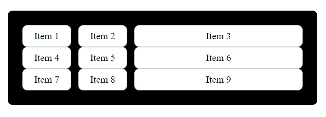
Example:
.container {
display: grid;
grid-template-columns: minmax(100px, 150px) 1fr 1fr;
}Here, this will create 3 columns. The first column will remain between 100px and 150px when the screen shrinks and the remaining two columns will adjust according to the available remaining space.
fit-content() Function
This function allows you to specify the size of a grid item based on its content.
Syntax:
fit-content(size);The size can be a length (px, em, rem, etc.), a percentage, a flex value, or one of the keyword values max-content, min-content, or auto.
Example:
.container {
display: grid;
grid-template-columns: fit-content(25%) 1fr;
}Here, the first column will be sized to fit its content up to a maximum width of 25%, and the second column will take up the remaining available space.
Grid Layout Cheatsheet
You can refer to this cheatsheet for quick reference:
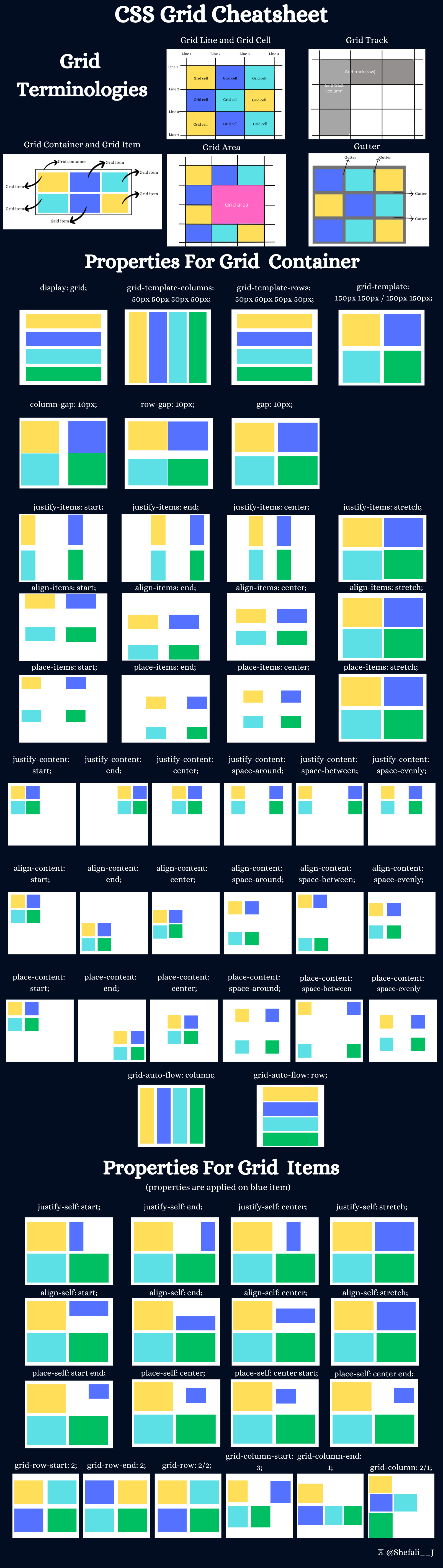
Download link for the cheatsheet
👉 Next tutorial: Centering (vertical & horizontal)