Fonts
You can refer to this cheatsheet for CSS fonts:
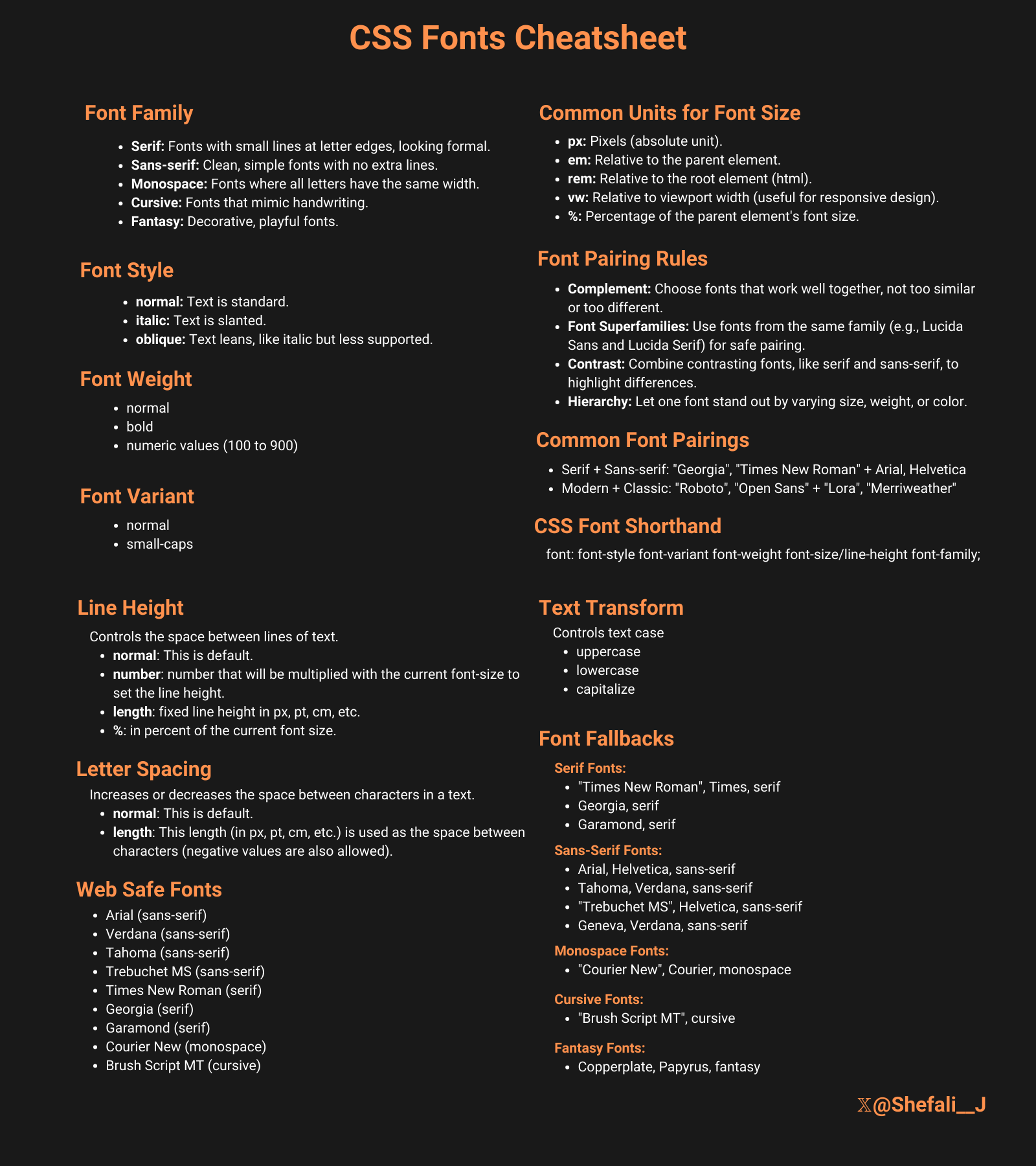
Download link for the cheatsheet
.png)
Responsive Typography
Responsive typography means text size adjusts smoothly based on the screen size or device, improving readability across all devices — from phones to large desktops.
There are two common approaches for implementing responsive typography:
- Media Queries
Clamp()Function
Media Queries
Media queries let you define different font sizes at specific screen widths (breakpoints). When the viewport matches a condition, the font size changes accordingly.
For example:
h1 {
font-size: 2rem; /* Default font size for larger screens */
}
@media (max-width: 600px) {
h1 {
font-size: 1.5rem; /* Smaller font size on screens 600px wide or less */
}
}- On screens wider than 600px, the heading (h1) is 2rem (usually 32px if root font size is 16px).
- On smaller screens (600px and below), the font size reduces to 1.5rem (24px) to fit better and avoid overflow or excessive space usage.
Clamp() Function
The clamp() function offers fluid and flexible typography by smoothly scaling the font size between a minimum and maximum value, based on the viewport width.
Syntax:
font-size: clamp(minimum, preferred, maximum);- Minimum: The smallest font size allowed
- Preferred: A scaling value, often relative to viewport width (vw)
- Maximum: The largest font size allowed
Example:
h1 {
font-size: clamp(1.5rem, 4vw, 3rem);
}- The font size will never be smaller than 1.5rem (24px).
- It will try to scale fluidly with 4vw (4% of the viewport width). So as the viewport grows or shrinks, the font size changes proportionally — ensuring it’s neither too small on mobile nor too large on big screens.
- But it will never grow larger than 3rem (48px), even on very large screens.
This creates a smooth scaling effect that adapts naturally to any screen size, eliminating the need for multiple media queries.
Why use clamp() over media queries?
- Simpler code: One line replaces many media queries.
- Smooth scaling: Unlike media queries, which cause sudden jumps in font size,
clamp()creates fluid transitions. - Better UX: Text adjusts continuously, making reading comfortable on all screen sizes.
- Performance: Fewer CSS rules and less code to maintain.
Text Alignment, Decoration, Transform
Text Alignment
You can use the text-align property to control the horizontal alignment of text inside a block container.
It provides the following values:
left— default, aligns text to the leftright— aligns text to the rightcenter— centers text horizontallyjustify— adjusts spacing to align both left and right edges
Example:
p {
text-align: justify;
}Text Decoration
You can use the text-decoration property to add visual decorations like underlines or strikethroughs.
It provides the following values:
none— removes decorationsunderline— adds underlineoverline— adds a line above the textline-through— strikethrough (cross out)
Example:
a {
text-decoration: underline;
}text-decoration-thickness
This property controls the thickness of the line.
a {
text-decoration: underline;
text-decoration-thickness: 2px;
}text-decoration-style
This property changes the style of the line (e.g., solid, dotted, wavy).
a {
text-decoration: underline;
text-decoration-style: wavy;
}Text Transform
You can use the text-transform property to change the case of text without modifying the HTML content.
It provides the following values:
none— default, no changeuppercase— converts to uppercase letterslowercase— converts to lowercase letterscapitalize— capitalizes the first letter of each word
Example:
h2 {
text-transform: capitalize;
}Line Height, Letter Spacing, Word Spacing
Line Height
You can use the line-height property to control the vertical space between lines of text (leading).
- Default is about 1.2 (120% of font size)
- Larger values increase spacing for readability
- Can be unitless (recommended) or use units (px, em or %)
Example:
p {
line-height: 1.6; /* 1.6 times font size */
}A unitless value means it multiplies the font size automatically, so it's more flexible and works better when styles are inherited.
Letter Spacing
You can use the letter-spacing property to adjust the space between characters. It can be positive (space out) or negative (tighten).
Example:
h1 {
letter-spacing: 2px;
}Too much letter spacing can reduce readability.
Letter spacing is often used in logos, headings, or hero sections to give a cleaner, more spaced-out look.
Word Spacing
You can use the word-spacing property to adjust the space between words.
Example:
p {
word-spacing: 5px;
}It’s not used as often as letter spacing, but it helps with text style and alignment when needed.
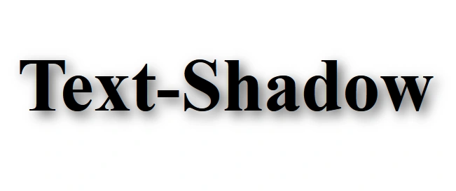
Text Shadows
You can use the text-shadow property to create a shadow effect on text, creating depth and making the text more visually appealing.
Syntax:
text-shadow: h-shadow v-shadow blur-radius color;- h-shadow: Horizontal shadow position (required).
- v-shadow: Vertical shadow position (required).
- blur-radius: Optional. Defines the blur distance. The higher the value, the more blurred the shadow becomes.
- color: Optional. Specifies the color of the shadow.
Example 1:
<!DOCTYPE html>
<html lang="en">
<head>
<meta charset="UTF-8" />
<meta name="viewport" content="width=device-width, initial-scale=1.0" />
<title>Text-Shadow Property</title>
<style>
h1 {
text-shadow: 2px 2px 5px #585858;
}
</style>
</head>
<body>
<h1>Text-Shadow</h1>
</body>
</html>
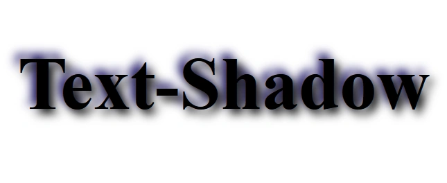
Example 2:
<!DOCTYPE html>
<html lang="en">
<head>
<meta charset="UTF-8" />
<meta name="viewport" content="width=device-width, initial-scale=1.0" />
<title>Text-Shadow Property</title>
<style>
h1 {
text-shadow: 2px 2px 4px #000000, -2px -2px 4px #150c66;
}
</style>
</head>
<body>
<h1>Text-Shadow</h1>
</body>
</html>
👉 Next tutorial: CSS Visual Effects