Margin
CSS margins are used for controlling spacing around elements in a webpage layout. They create space between an element’s border and its neighbouring elements.
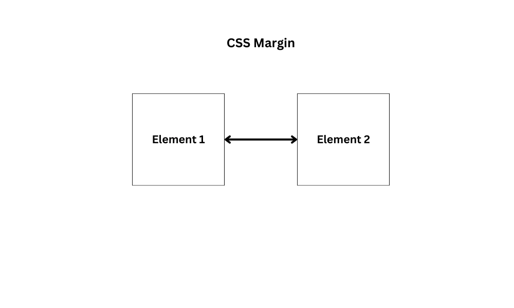
The margin property allows you to adjust the margins for an element. You can set different values for the top, right, bottom, and left margins, or use the shorthand for all margins at once.
Margin Properties
margin-top: This property is used to set the margin on the top side.margin-bottom: This property is used to set the margin on the bottom side.margin-left: This property is used to set the margin on the left side.margin-right: This property is used to set the margin on the right side.
Note: negative values are allowed.
Margin Values
auto– the browser calculates the margin.length– specifies a margin inpx,pt,cm, etc.%– specifies a margin in%of the width of the container.inherit– makes the margin inherit from the parent element.
Example of Margin
In the below example, two boxes are presented without any margin applied to them.
<!DOCTYPE html>
<html lang="en">
<head>
<meta charset="UTF-8" />
<meta http-equiv="X-UA-Compatible" content="IE=edge" />
<meta name="viewport" content="width=device-width, initial-scale=1.0" />
<title>CSS Margin</title>
<style>
.box {
height: 200px;
width: 200px;
}
.box1 {
background-color: #74b7b7;
}
.box2 {
background-color: #286c6e;
}
</style>
</head>
<body>
<div class="box box1"></div>
<div class="box box2"></div>
</body>
</html>The Output of the above code:

Now to separate the boxes with some space, add the margin to the boxes.
.box {
height: 200px;
width: 200px;
}
.box1 {
background-color: #74b7b7;
margin-top: 5%;
margin-left: 10%;
margin-bottom: 3%;
}
.box2 {
background-color: #286c6e;
margin-top: 2%;
margin-left: 10%;
}Output:

Margin Shorthand Property
You can use the margin shorthand property to set all four margin values at once.
Syntax:
margin: top right bottom left;Tip: The shorthand follows the clockwise pattern – top → right → bottom → left.
Following are the four cases for applying the margin shorthand property.
margin: 5px 2px 3px 10px;
(margin: top right bottom left;)Here top margin is set to 5px, the right margin is set to 2px, the bottom margin is set to 3px and the left margin is set to 10px.
margin: 5px 2px 10px;
(margin: top right-and-left bottom;)Here top margin is set to 5px, the right and left margins are set to 2px and the bottom margin is set to 10px.
margin: 5px 10px;
(margin: top-and-bottom right-and-left;)Here top and bottom margins are set to 5px and left and right margins are set to 10px.
margin: 5px;
(margin: top-bottom-right-left;)Here all four margins are set to 5px.
Padding
Padding is used to create space between an element’s content and its border. It affects the space inside the element.
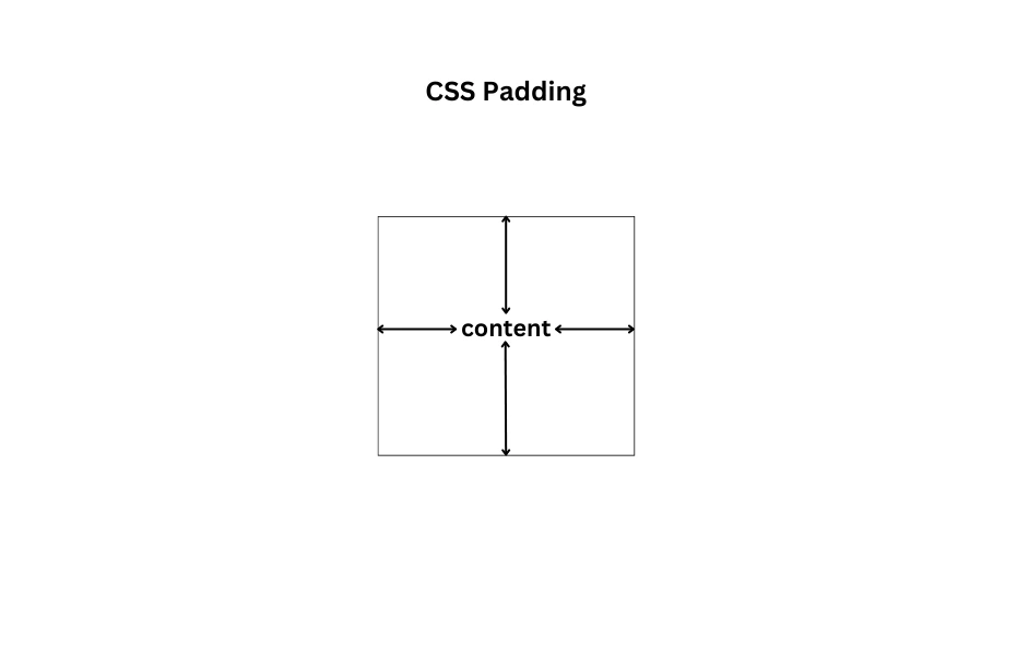
The padding property allows you to adjust the padding for an element. You can set different values for the top, right, bottom, and left padding or use the shorthand for all paddings at once.
Padding Properties
padding-top: This property is used to set the padding on the top side.padding-bottom: This property is used to set the padding on the bottom side.padding-left: This property is used to set the padding on the left side.padding-right: This property is used to set the padding on the right side.
Note: negative values are not allowed.
Padding Values
length– specifies padding inpx,pt,cm, etc.%– specifies padding in % of the width of the container.inherit– makes the padding inherit from the parent element.
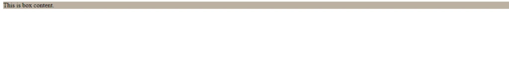
Example of Padding
In the below example, the content is presented without any padding inside the box.
<!DOCTYPE html>
<html lang="en">
<head>
<meta charset="UTF-8" />
<meta http-equiv="X-UA-Compatible" content="IE=edge" />
<meta name="viewport" content="width=device-width, initial-scale=1.0" />
<title>CSS Padding</title>
<style>
.box {
background-color: #bbb0a2;
}
</style>
</head>
<body>
<div class="box">This is box content.</div>
</body>
</html>Output:
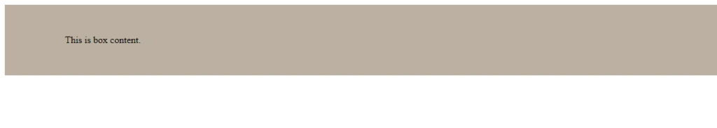
Now to add space between the content and the box, add the padding property.
.box {
background-color: #bbb0a2;
padding-top: 50px;
padding-right: 40px;
padding-bottom: 50px;
padding-left: 100px;
}
Output:
Padding Shorthand Property
You can use the padding shorthand property to set all four padding values at once.
Syntax:
padding: top right bottom left;Tip: The shorthand follows the clockwise pattern – top → right → bottom → left.
Following are the four cases for applying the padding shorthand property.
padding: 5px 2px 3px 10px;
(padding: top right bottom left;)Here top padding is set to 5px, right padding is set to 2px, bottom padding is set to 3px and left padding is set to 10px.
padding: 5px 2px 10px;
(padding: top right-and-left bottom;)Here top padding is set to 5px, the right and left paddings are set to 2px and the bottom padding is set to 10px.
padding: 5px 10px;
(padding: top-and-bottom right-and-left;)Here top and bottom paddings are set to 5px and left and right paddings are set to 10px.
padding: 5px;
(padding: top-bottom-right-left;)Here all four paddings are set to 5px.
Padding and Width of the Element
If you apply padding property to a specified width element, then the padding of that element will be added to the total width of the element. For example:
.box {
background-color: #bbb0a2;
width: 100px;
padding: 20px;
}Then the total width of the above element will be 140px (100px width of the element + 20px left padding + 20px right padding).
Thus, to maintain the actual width of the element you can use the box-sizing property.
.box {
background-color: #bbb0a2;
width: 100px;
padding: 20px;
box-sizing: border-box;
}box-sizing: border-box; is recommended for most layouts to avoid unexpected element sizes due to padding or borders.
Difference Between Margin and Padding
| Margin | Padding |
|---|---|
| Create space between an element’s border and its neighboring elements. | Create space between an element’s content and its border. |
| Creates space outside the element, between its border and other elements. | Creates space inside the element, between content and border. |
The Box Model
The CSS box model describes how HTML elements are displayed and sized. It provides a way to control spacing, borders, and how content fits within an element, offering flexibility for customization.
It contains the following properties👇
Content
This is the actual content of the element, such as text, images, or other nested HTML elements. It's the innermost part of the box model where your main content resides.
Padding
This is the space between an element’s content and its border. It helps control the spacing within an element.
Border
This is a line that surrounds the padding and content of an element. You can customize its width, style, and color to define how the element visually separates from other elements on the page.
Margin
This is the space between an element’s border and its neighbouring elements. It controls the outermost spacing, ensuring that elements don’t touch each other directly.
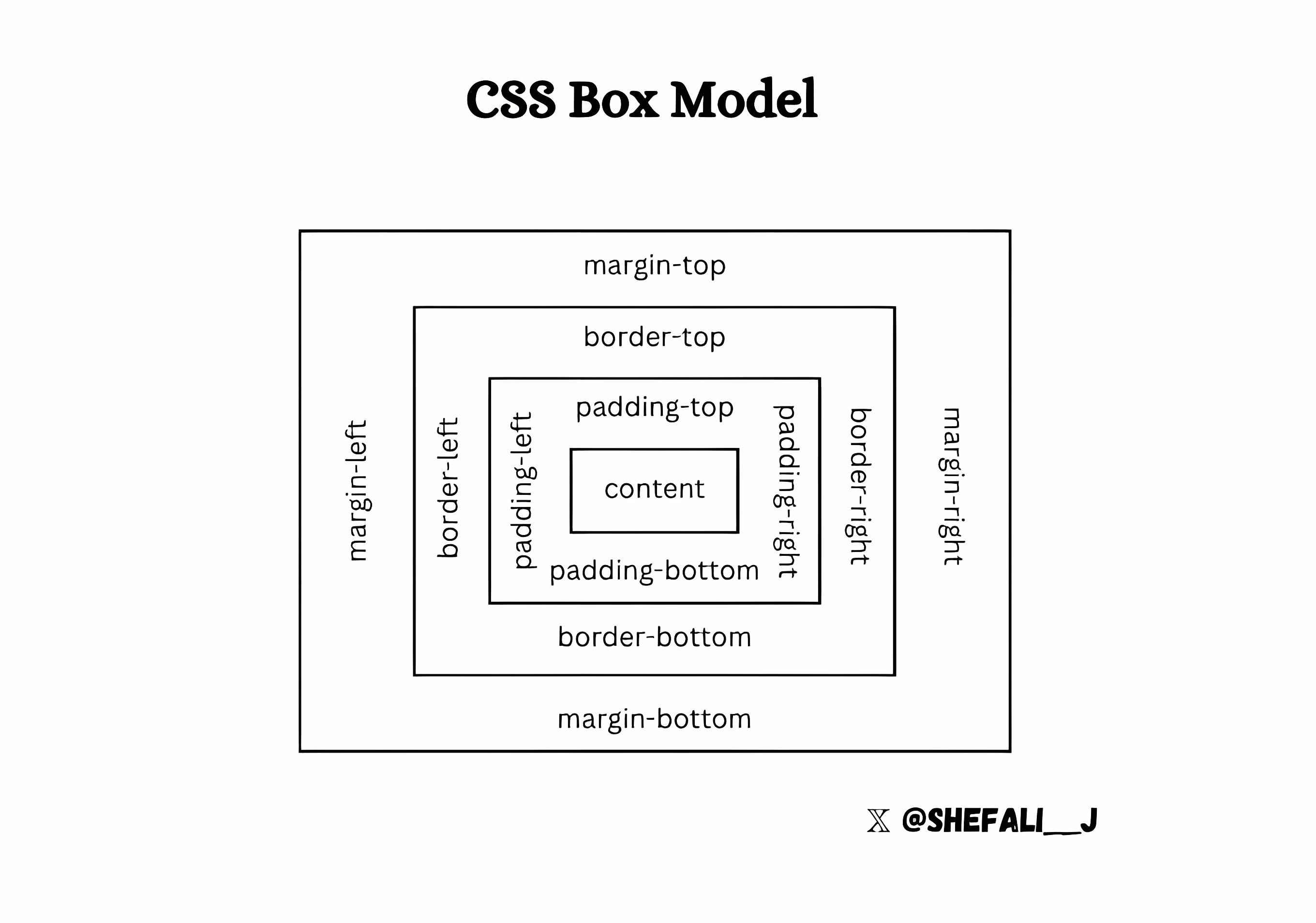
Each of these properties plays a crucial role in determining how an element is sized and positioned relative to others, and mastering the box model is key to creating well-structured, responsive web designs.
👉 Next tutorial: CSS Display Property