The CSS position property is used to control the position of an element on a webpage. It defines how an element should be positioned relative to its containing element or the viewport.
The following are the possible values for the position property:
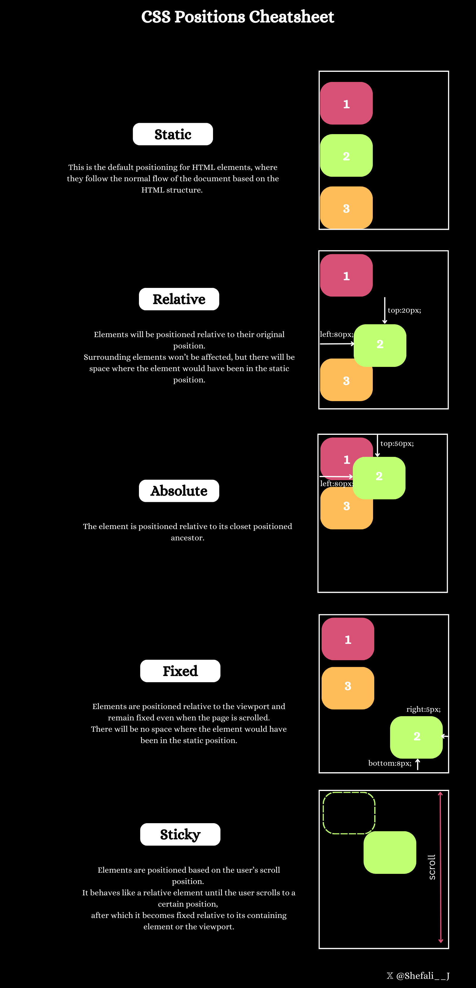
Static
This is the default value for all HTML elements’ positioning. In this positioning, elements are positioned in the normal flow of the document, which means they are positioned one after another following the HTML structure. Their margins and paddings determine the positioning of elements in this mode.
Applying the top, right, bottom, or left properties to a statically positioned element will have no effect. z-index also does not apply to static elements.
Syntax:
position: static;For example:
<!DOCTYPE html>
<html lang="en">
<head>
<meta charset="UTF-8" />
<meta http-equiv="X-UA-Compatible" content="IE=edge" />
<meta name="viewport" content="width=device-width, initial-scale=1.0" />
<link rel="stylesheet" href="style.css" />
<title>CSS position property</title>
</head>
<body>
<div class="box box1">Box1</div>
<div class="box box2">Box2</div>
<div class="box box3">Box3</div>
</body>
</html>CSS:
.box {
height: 100px;
width: 100px;
border-radius: 10px;
margin: 10px;
text-align: center;
color: white;
padding: 10px;
}
.box1 {
background-color: red;
}
.box2 {
background-color: blue;
position: static;
}
.box3 {
background-color: green;
}
Output:
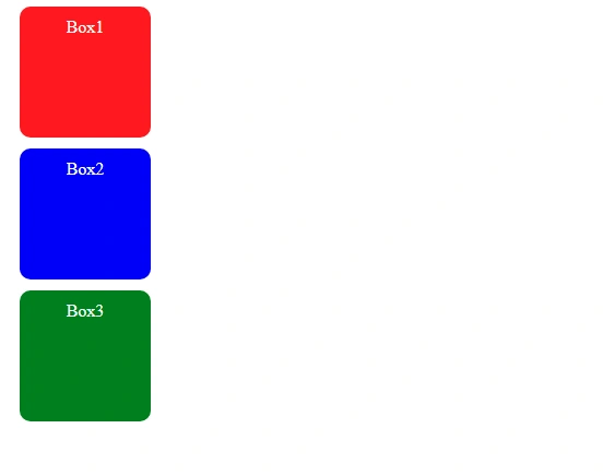
In the above example, we have 3 boxes, all having the same height and width. The position: static; property is applied only to the second box. However, it doesn’t differ the layout of the second box with the other two boxes because static is the default value for all of the HTML elements.
Relative
With position: relative elements follow their normal document flow but can be shifted from their original position. This can be achieved using the top, right, bottom, and left properties.
With this property, surrounding elements won’t be affected, but there will be space where the element would have been in the static position.
Syntax:
position: relative;For example:
<!DOCTYPE html>
<html lang="en">
<head>
<meta charset="UTF-8" />
<meta http-equiv="X-UA-Compatible" content="IE=edge" />
<meta name="viewport" content="width=device-width, initial-scale=1.0" />
<link rel="stylesheet" href="style.css" />
<title>CSS position property</title>
</head>
<body>
<div class="box box1">Box1</div>
<div class="box box2">Box2</div>
<div class="box box3">Box3</div>
</body>
</html>CSS:
.box {
height: 100px;
width: 100px;
border-radius: 10px;
margin: 10px;
text-align: center;
color: white;
padding: 10px;
}
.box1 {
background-color: red;
}
.box2 {
background-color: blue;
position: relative;
top: 20px;
left: 50px;
}
.box3 {
background-color: green;
}Output:
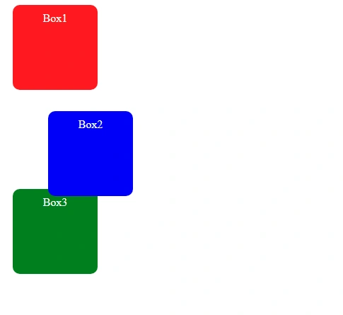
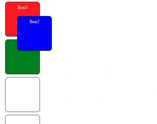
In the above example, the second box is shifted 20 pixels down (using the top property) and 50 pixels to the right (using the left property). The shifted box does not affect the position of surrounding elements (box 1 and box 3).
Absolute
With position: absolute, elements do not follow the normal flow of the document. The element is positioned relative to its closest positioned ancestor (an element with the positioning of relative, absolute, fixed, or sticky).
Syntax:
position: absolute;For example:
<!DOCTYPE html>
<html lang="en">
<head>
<meta charset="UTF-8" />
<meta http-equiv="X-UA-Compatible" content="IE=edge" />
<meta name="viewport" content="width=device-width, initial-scale=1.0" />
<link rel="stylesheet" href="style.css" />
<title>CSS position property</title>
</head>
<body>
<div class="box box1">Box1</div>
<div class="container">
<div class="box box2">Box2</div>
</div>
<div class="box box3">Box3</div>
</body>
</html>CSS:
.box {
height: 100px;
width: 100px;
border-radius: 10px;
margin: 10px;
text-align: center;
color: white;
padding: 10px;
}
.container {
border: 3px solid black;
height: 200px;
width: 200px;
position: relative;
}
.box1 {
background-color: red;
}
.box2 {
background-color: blue;
position: absolute;
top: 30px;
left: 50px;
}
.box3 {
background-color: green;
}
Output:
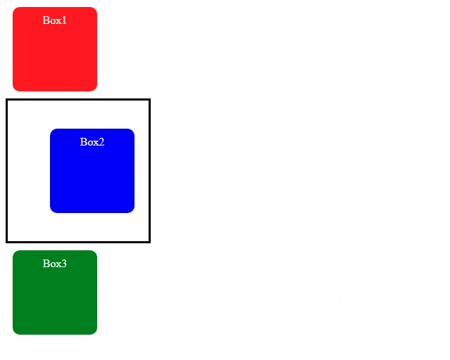
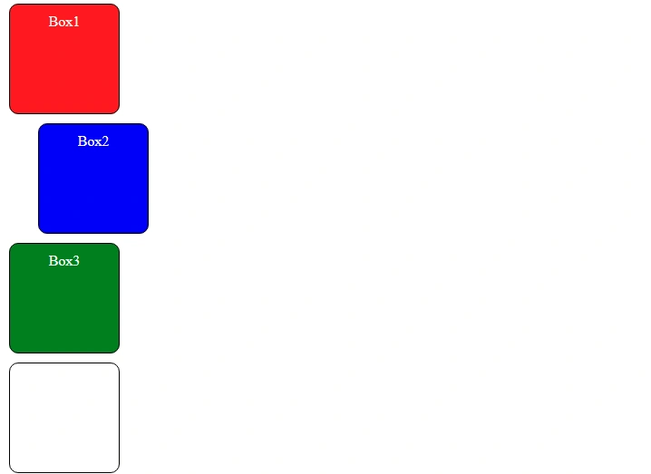
In the above example, the second box is inside a container. The position of the container is set to relative, and the position of the second box is set to absolute, and the box is shifted 30 pixels down (using the top property) and 50 pixels to the right (using the left property). The container is the ancestor of the second box.
Now, what if there is no ancestor?
Then the element will be positioned relative to the viewport.
For example:
<!DOCTYPE html>
<html lang="en">
<head>
<meta charset="UTF-8" />
<meta http-equiv="X-UA-Compatible" content="IE=edge" />
<meta name="viewport" content="width=device-width, initial-scale=1.0" />
<link rel="stylesheet" href="style.css" />
<title>CSS position property</title>
</head>
<body>
<div class="box box1">Box1</div>
<div class="box box2">Box2</div>
<div class="box box3">Box3</div>
</body>
</html>CSS:
.box {
height: 100px;
width: 100px;
border-radius: 10px;
margin: 10px;
text-align: center;
color: white;
padding: 10px;
}
.box1 {
background-color: red;
}
.box2 {
background-color: blue;
position: absolute;
top: 30px;
left: 50px;
}
.box3 {
background-color: green;
}
Output:
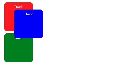
Fixed
With position: fixed, elements are positioned relative to the viewport and remain fixed even when the page is scrolled.
Syntax:
position: fixed;For example:
<!DOCTYPE html>
<html lang="en">
<head>
<meta charset="UTF-8" />
<meta http-equiv="X-UA-Compatible" content="IE=edge" />
<meta name="viewport" content="width=device-width, initial-scale=1.0" />
<link rel="stylesheet" href="style.css" />
<title>CSS position property</title>
</head>
<body>
<div class="box box1">Box1</div>
<div class="box box2">Box2</div>
<div class="box box3">Box3</div>
<div class="box"></div>
<div class="box"></div>
<div class="box"></div>
<div class="box"></div>
<div class="box"></div>
<div class="box"></div>
<div class="box"></div>
<div class="box"></div>
</body>
</html>CSS:
.box {
height: 100px;
width: 100px;
border-radius: 10px;
margin: 10px;
text-align: center;
color: white;
padding: 10px;
border: 1px solid black;
}
.box1 {
background-color: red;
}
.box2 {
background-color: blue;
position: fixed;
top: 50px;
left: 50px;
}
.box3 {
background-color: green;
}
Output:
In the above example, the position of the second box will be fixed, even if you scroll down the page.
With this property, unlike position: relative;, there will be no space where the element would have been in the static position.
Sticky
With position: sticky, elements are positioned based on the user’s scroll position. It behaves like a relative element until the user scrolls to a certain position, after which it becomes fixed relative to its containing element or the viewport.
Syntax:
position: sticky;For example:
<!DOCTYPE html>
<html lang="en">
<head>
<meta charset="UTF-8" />
<meta http-equiv="X-UA-Compatible" content="IE=edge" />
<meta name="viewport" content="width=device-width, initial-scale=1.0" />
<link rel="stylesheet" href="style.css" />
<title>CSS position property</title>
</head>
<body>
<div class="box box1">Box1</div>
<div class="box box2">Box2</div>
<div class="box box3">Box3</div>
<div class="box"></div>
<div class="box"></div>
<div class="box"></div>
<div class="box"></div>
<div class="box"></div>
<div class="box"></div>
<div class="box"></div>
<div class="box"></div>
</body>
</html>CSS:
.box {
height: 100px;
width: 100px;
border-radius: 10px;
margin: 10px;
text-align: center;
color: white;
padding: 10px;
border: 1px solid black;
}
.box1 {
background-color: red;
}
.box2 {
background-color: blue;
position: sticky;
top: 50px;
left: 50px;
}
.box3 {
background-color: green;
}
Output:
In the above example, the second box will behave like a relative element until it reaches the position top: 50px; on scrolling, then it will behave like a fixed element.
Position Cheatsheet
You can refer to this cheatsheet for quick reference:
Download link for the cheatsheet
👉 Next tutorial: CSS Flexbox