Flexbox is a powerful CSS3 layout that allows you to create responsive and mobile-friendly websites. With its wide browser support, Flexbox empowers developers to design and build dynamic web layouts.
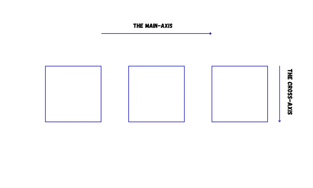
The Main Axis and The Cross Axis
Flexbox operates along two axes:
- main-axis
- cross-axis
The main axis is set by the flex-direction property.
If the flex-direction is row, then the main axis runs along the row, and if the flex-direction is column, then the main axis runs along the column.
The cross-axis runs perpendicular to the main axis. That means if the flex-direction is row, then the cross-axis runs along the column, and if the flex-direction is column, then the cross-axis runs along the row.
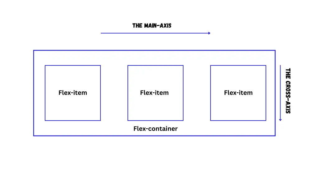
Flex container
To create a flex container, simply apply the display: flex; property to the parent element.
For example:
<div class="container">
<div class="item">Item1</div>
<div class="item">Item2</div>
<div class="item">Item3</div>
</div>CSS:
.container {
display: flex;
border: 1px solid black;
height: 400px;
}
.item {
width: 100px;
height: 100px;
border: 1px solid red;
}By doing this, all direct child elements transform into flex items. You can manipulate all these flex items using various flex properties.
Flex items can be blocks, inline blocks, or inline elements.
Let's see the properties of manipulating the flex items within the flex container.
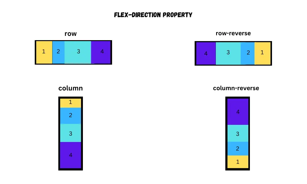
Flex direction
The flex-direction property is used to set the direction of flex items. To set the direction, use one of the following values with the property.
- row
- row-reverse
- column
- column-reverse
For example:
.container {
display: flex;
flex-direction: column;
border: 1px solid black;
height: 400px;
}
.item {
width: 100px;
height: 100px;
border: 1px solid red;
}By default, the items display as row. If you want to display the items as row, then you don’t need to add the flex-direction property.
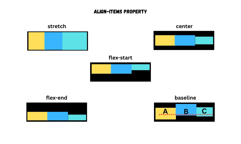
Align items
The align-items property puts the flex-items along the cross-axis(vertical) of the flex container.
For example:
.container {
display: flex;
align-items: center;
border: 1px solid black;
height: 400px;
}
.item {
width: 100px;
height: 100px;
border: 1px solid red;
}It provides the following values:
stretch- makes the height (row directions) or width (column directions) of the items equal to the size of the container.center- puts the items in the center.start or flex-start- puts the items from the start of the container.end or flex-end- puts the items at the end of the container.baseline- puts the items next to each other with their baselines being at the same position.
By default, its value is stretch.
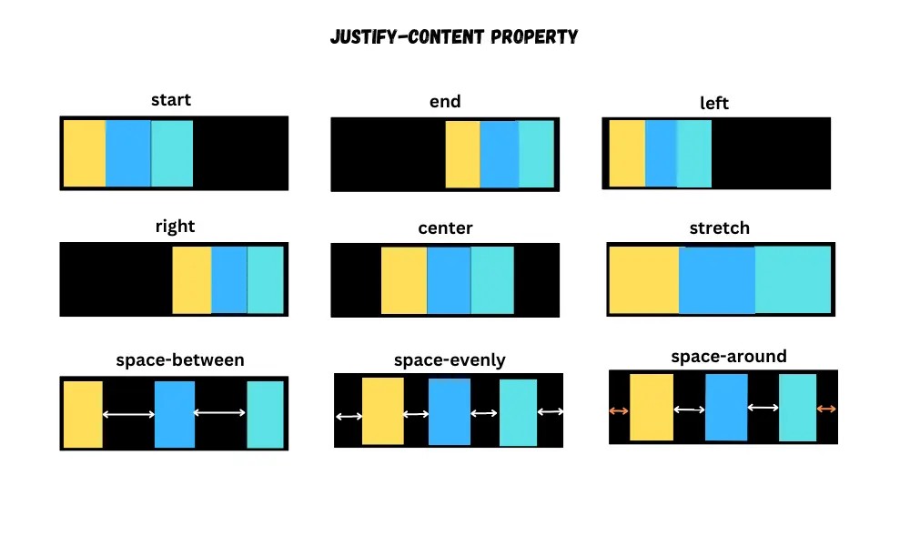
Justify content
The justify-content property puts the flex items along the main axis(horizontal) of the flex container.
For example:
.container {
display: flex;
justify-content: end;
border: 1px solid black;
height: 400px;
}
.item {
width: 100px;
height: 100px;
border: 1px solid red;
}It provides the following values:
start or flex-start- puts the items from the start of the container.end or flex-end- puts the items from the end of the container.left– puts items on the left side of the container.right– puts items on the right side of the container.center- puts items around the container.stretch- stretches the size of the items to fill the container.space-between– puts the first item at the start and the last item at the end of the container and separates every item with an identical space.space-evenly– puts the items within the container, ensuring they are evenly spaced from each other and the container's edges.space-around– puts the items with equal spacing, leaving a half-size gap on each end.
By default, its value is start.
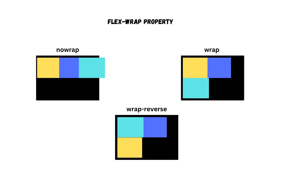
Flex wrap
By default, flex items are positioned in a single line within the flex container. However, when the screen size shrinks, these flex items may overflow. To prevent this, you can utilize the flex-wrap property.
It provides three values:
nowrap(default) - causes overflow of flex-items.wrap- creates new rows to prevent overflowing of flex items.wrap-reverse- works the same as awrap, but the order of flex-items is reversed.
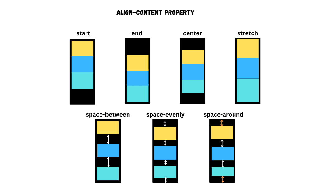
Align content
If there is extra space along the cross-axis, then the align-content property helps to align the multiple lines of flex items.
For this to work, there should be multiple lines along the cross-axis. It provides the following values:
start or flex-startend or flex-endcenterstretchspace-betweenspace-evenlyspace-around
By default, its value is stretch.
Use flex-wrap: wrap; to see the align-content property in action.
For example:
.container {
display: flex;
align-content: end;
flex-wrap: wrap;
border: 1px solid black;
height: 400px;
width: 100px;
}
.item {
width: 100px;
height: 100px;
border: 1px solid red;
}
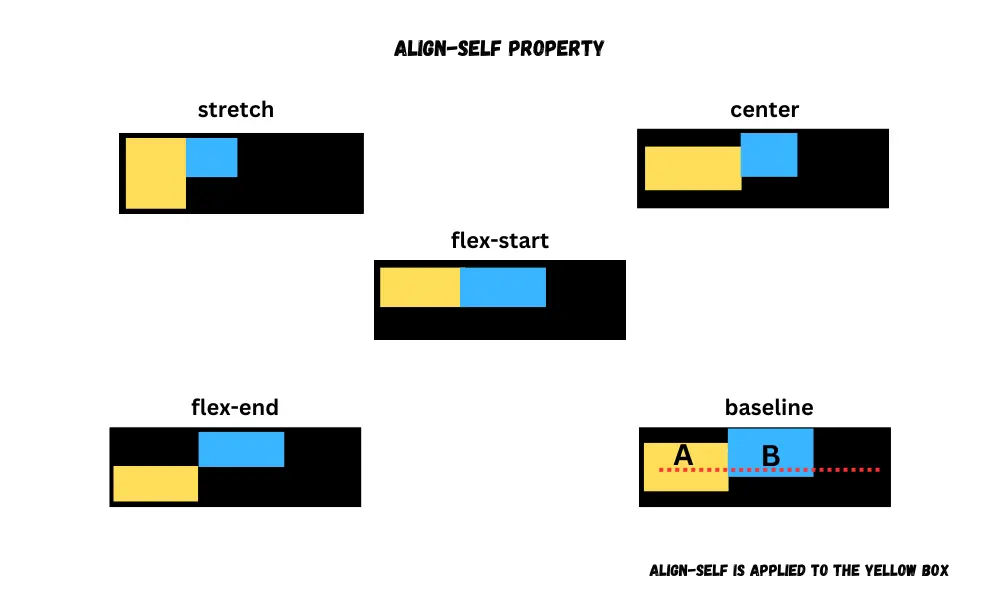
Align self
The align-self property is used to align a specific flex item. It provides the following values, same as the align-items property.
stretchcenterstart or flex-startend or flex-endbaseline
For example:
.container {
display: flex;
border: 1px solid black;
height: 400px;
}
.item {
width: 100px;
height: 100px;
border: 1px solid red;
}
.item:nth-child(2) {
align-self: flex-end;
}
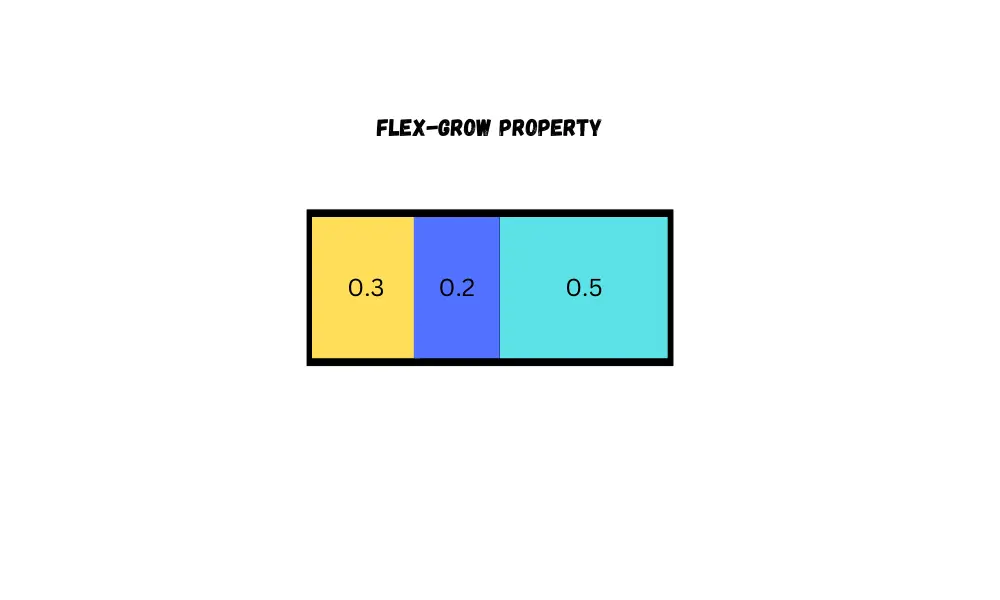
Flex grow
By using the flex-grow property, you can control the space taken up by a flex item. To configure it, you can give it a number between 0 and 1. The default value is 0.
When the flex-grow property is applied to multiple flex-items, then any additional space will be distributed proportionally according to their respective flex-grow values.
For example:
.container {
display: flex;
border: 1px solid black;
height: 400px;
}
.item {
width: 100px;
height: 100px;
border: 1px solid red;
}
.item:nth-child(2) {
flex-grow: 0.3;
}
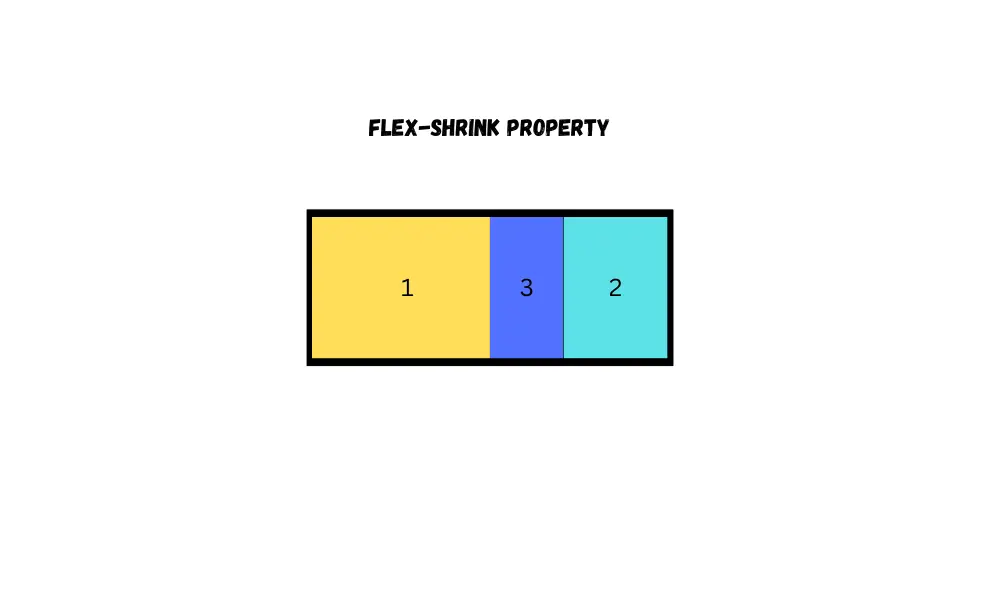
Flex shrink
By using the flex-shrink property, you can control how flex items behave when the available space in the flex container is insufficient, i.e., flex-items are too big for their container. To configure it, you can give it a number value. The default value is 1.
For example:
.container {
display: flex;
border: 1px solid black;
height: 400px;
width: 200px;
}
.item {
width: 100px;
height: 100px;
border: 1px solid red;
}
.item:nth-child(2) {
flex-shrink: 2;
}If you give it the value 0, then the flex item will not shrink.
If one item has flex-shrink: 1; and the second item has flex-shrink: 2; then the second item will shrink twice as much as the first item.
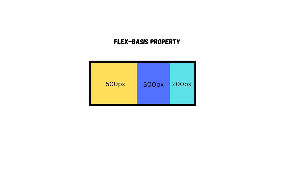
Flex basis
By using the flex-basis property, you can set the initial size of flex items within a flex container along the main axis (horizontal).
In other words, if the flex-direction is row, then the flex-basis does the same thing as width, and if the flex-direction is column, then the flex-basis does the same thing as height.
For example:
.container {
display: flex;
flex-direction: column;
border: 1px solid black;
height: 400px;
}
.item {
width: 100px;
height: 100px;
border: 1px solid red;
}
.item:nth-child(2) {
flex-basis: 500px;
}
Flex order
Flex items are arranged within a flex container according to the HTML code. The Document Object Model (DOM) (using CSS) can be manipulated by using the flex order property.
The order property only accepts whole numbers within the range of the maximum number of flex items.
For example:
.container {
display: flex;
border: 1px solid black;
height: 400px;
}
.item {
width: 100px;
height: 100px;
border: 1px solid red;
}
.item:nth-child(2) {
order: 3;
}If a negative value is assigned to the flex item, then the element will be positioned as the first item.
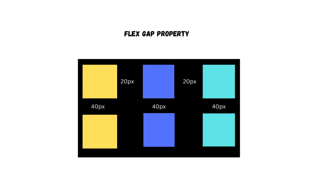
Gaps
The gap property is used to specify the space between flex items.
For example:
.container {
display: flex;
flex-direction: column;
border: 1px solid black;
height: 400px;
gap: 30px;
}
.item {
width: 100px;
height: 100px;
border: 1px solid red;
}
Flexbox Cheatsheet
You can refer to this cheatsheet for quick reference:
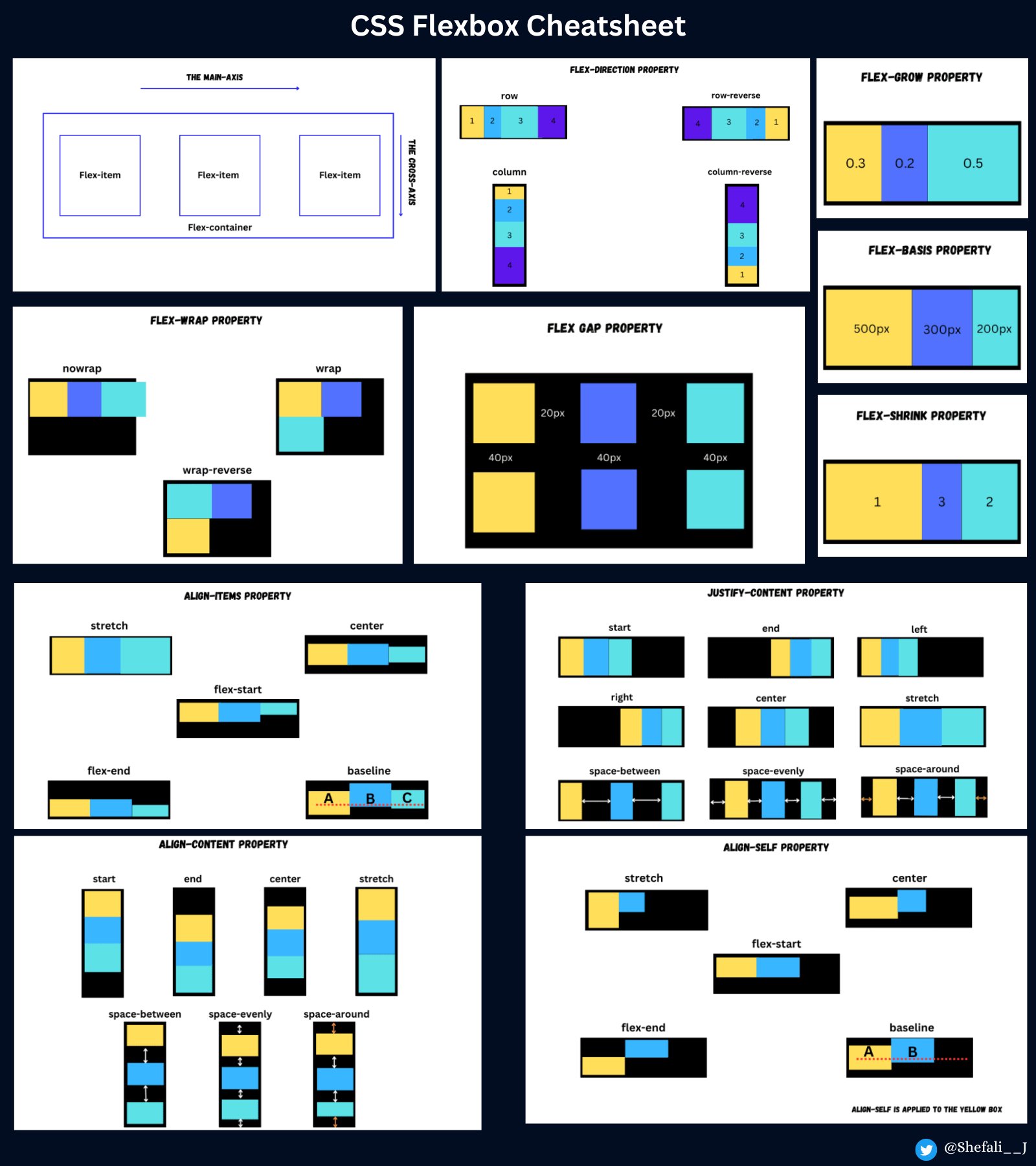
Download link for the cheatsheet
👉 Next tutorial: CSS Grid Layout